In last tutorial on gantt chart in Excel for project managers we learnt the simplest and fastest way to chart project activities/tasks. Today we are learning how to add a vertical line on the gantt chart representing current or any other specific date for better understanding of the gantt chart user.
For this tutorial you need a gantt chart already done that I have discussed in detail here so if you do not have the gantt chart ready, get it done and then continue with this tutorial.
This is what we will be achieving by the end of this tutorial:
Add a vertical line to Gantt Chart Excel Stacked Bar Chart – Step by Step
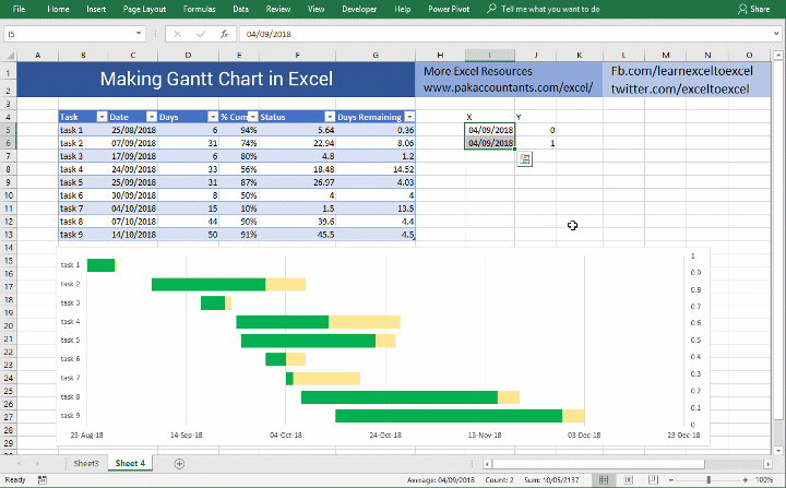
For any straight line you need at least two points on the chart and for each point you need two coordinates where each is representing its reference location along X and Y axis.
Gantt chart is horizontal stacked bar chart running from left to right, therefore we would like to have our “time-line” running perpendicular to these bars top to bottom. Also, the dates are charted along the X-axis so our ‘time-line’ will be perpendicular to X-axis with x-coordinate to be either current date (or specific date if we choose to show specific date). If it doesn’t make sense yet, don’t worry and lets move on!
Step 1: In two empty cells input X and Y each. Under X put the current date either manually or use TODAY() function. Repeat the same in the next row as well. You can use any other specific date of your own choice as well.
Under Y put 0 in first row and 1 in second row under Y.
I will enter the date manually so that gantt chart with vertical line template file remains easy to understand for future readers as well otherwise to draw current date on gantt chart function approach is better.
Step 2: Select the cells you just created with values and copy them. This will load the values in clipboard.
Step 3: Select chart (don’t forget to select chart first) by simply clicking anywhere empty in it and go to home tab > click drop down arrow under paste button > click paste special. A dialogue box will open, leave the default values (i.e. new series, columns, series name in first row, categories in first column) and click OK. You will notice a small bit added to the chart in front of second task as new series.

Step 4: Right click on newly added series and click change series chart type. Click secondary axis check box and select scatter with straight lines. You will instantly see a vertical straight line added to the gantt chart. We are almost done.

Step 5: On the right side you will see newly inserted secondary vertical axis, double click on it to invoke format axis options. From there, in maximum input box, input 1 and press enter key.

If you feel that everything is fine then we are done. But if you like to format the line as well then continue with one last step.
Step 6: Double click on the vertical line to access format options. I colored it red and formatted it as dashed.
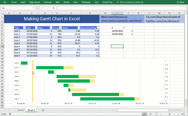
And finally here you have the gantt chart with vertical line working amazingly showing change in date immediately when date is changed! Remember you will have to change the date in both cells. Or better yet have the second cell reference to first one. In my case I will use the formula =I5 in cell I6 to fetch the date so that I will have to change the date only in one cell.
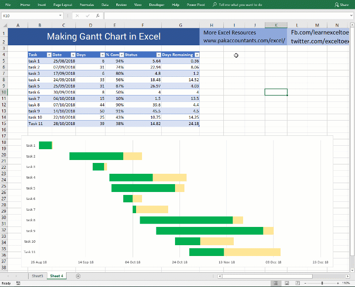
So there you have it! A fully functional gantt chart with planned and completion status indicated and also the current/specific date drawn right on the gantt chart all done in Excel!
Liked Gantt Chart with Vertical Date Line? – Pin it!

You helped me a lot!
Thank you.
Thank you so much!! You helped me a lot!
Dear Hasaan,
really good tips, however following your instructions created me two axes for the timeline that do not match, could you help me to align the bars and the line to the same timeline?
Many thanks
Danilo
this is amazing! thank you very much, been looking for this all day.
kindly advise, is it possible to add more than one vertical line in the same way? i redid the steps above, but it didnt seem to work
it sure is possible you just have to provide the coordinates of the second line the same way I believe.
Thanks. I used this Gantt chart idea to plot the genealogies in Genesis. Each bar showed when the person was born and how long they lived in relation to the others. I used your current date line to mark the flood so I could see that in relation to their lifelines.
Ha, I have just done exactly this! How did you manage to get the flood line to extend to the top of your chart? Mine cuts off about 2/3 of the way up
Good job.