In this tutorial we are learning how to make an awesome variance chart in Excel that clearly plots actual and target (budgeted) figures using bars and variances (favourable and unfavourable) with arrows so beautifully that you get the whole story without looking twice:
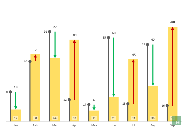 Some features of the Excel variance chart above we are learning today:
- Each element in the chart has its own place and doesn’t obstruct others. Best choice to plot dynamic data that changes frequently.
- Favorable variance is shown in green and unfavourable variance in red arrow with variances in number shown above.
- One series, either actual or target, takes lollipop shape bar with the relevant number to its left.
- Figures of the second series are plotted in yellow bar with the numbers at base. Again this series can either be actual or budgeted, planned or target series.
- Just provide actual and budgeted figures and get the chart done. Simple!
Get fully worked Excel Variance Chart Template
Skip the tutorial for now and get the file. This fully unlocked no secrets held Excel file is available for you to change and use at your disposal. It is designed to input data easily. You just have to provide actual and target data and rest will be done automatically. And any future revisions to this template will be sent to you absolutely free!
Buy NowGot a question? Contact details are here
What is a variance chart?
Most of the time variance charts compare two sets of series with each other to calculate the difference between each iteration. For example, we want to compare the sales of two companies for the last ten years. Comparing the sale of one company with the other for every year gives us variances or differences. Graphing these variances gives us variance charts.
There are a number of ways to make Excel variance charts from very simple ones like the one I discussed or a complex one with several Excel techniques applied for optimization like this one.
Important: Understanding Actual vs Target variances
As mentioned earlier, variance is simply a difference between actual and target or budgeted/planned numbers.
Understand one thing clearly, having actual greater than target isn’t always favourable. It depends on the nature of data and what the variance is about.
In case of cost, having actual lesser than the target is a good thing. But if data is about sales then having actual figures greater than the target is favourable.
For the purpose of this tutorial, I am making variance analysis for actual and budgeted costs. Therefore, if actual is less than target its favourable. And if a target is greater than actual then its unfavourable.
Advanced Excel Variance Charts – Step by step
Download this Excel workbook with sample data to follow along with the steps detailed in this tutorial.
There is a lot going on in this tutorial. So I have divided the whole in relevant bits for easy understanding.
Getting data ready for variance bars
As we are planning to plot favourable variance in green and unfavourable in red, we need to separate each from a single set of variances.
Step 1: In cell D1 give heading V. Green and in the cell, D2 put the following formula and double click the drag handle to populate down the cells:
=IF(B2>C2,B2-C2,””)
 Step 2: In cell E1 give heading V. Red and in cell E2 put the following formula and double click or drag the fill handle to populate the cells:
=IF(B2<C2,C2-B2,””)
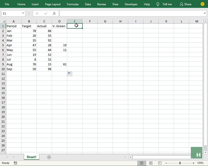 The above two steps split the variances in two so that each can be given a separate color. The formula basically checks if Actual is greater than target or not. If it is then the difference will show up under the green column. And if not then variance figure will appear under the red column.
Preparing data for actual and target series
Here we have a choice to make. Should it be actual series or target series that appears in bold bar? I prefer the actual series to appear as a bold column and target series as a lollipop to the left of each bar. This will clearly show actual results against planned targets on the chart.
Step 1: Go to cell F1 and put a heading Actual > Target and in cell F2 put the following formula and double click the fill handle to fill down:
=B2<C2
This checks if actual figure is greater than target figure and returns TRUE if it is the case. False if not.
Step 2: Go to cell G1 and give a heading Holder. And put the following formula in cell G2 and down the cells:
=IF(F2,B2,C2)
 This is an interesting series and I will explain once chart takes the shape for better understanding.
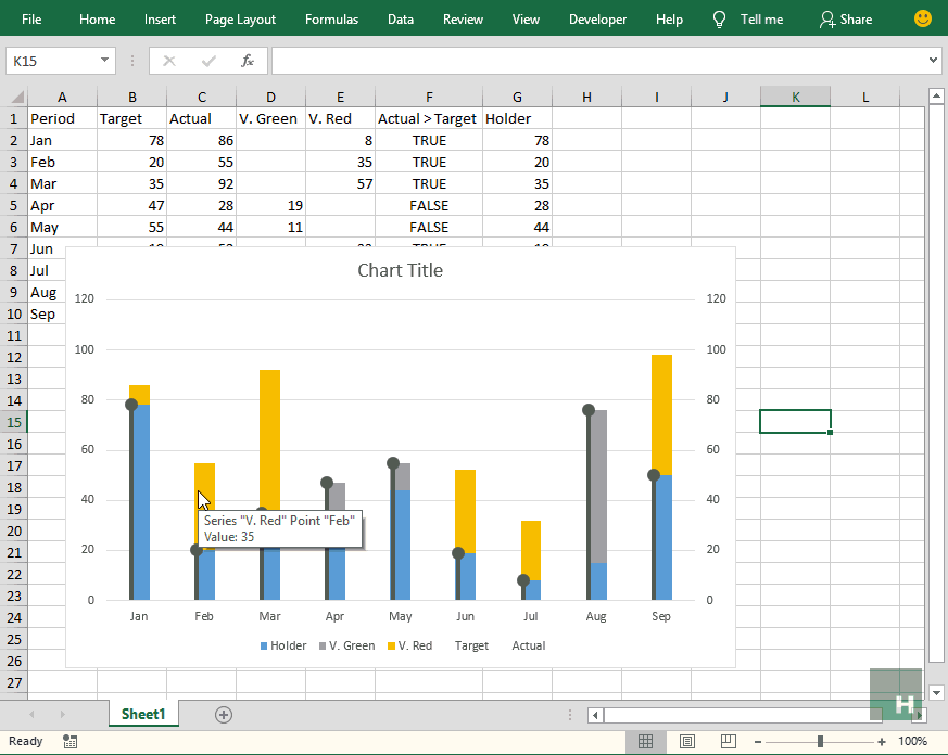
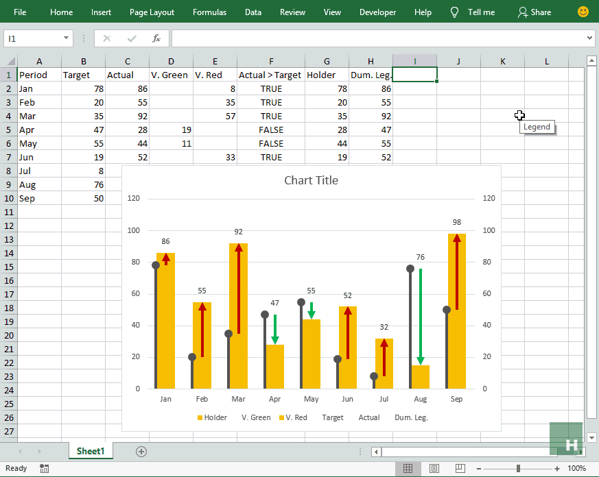
Making Excel variance chart
Step 1: Select all the columns except Actual > Target using CTRL key + mouse. Once selected hit ALT+F1 to insert a column chart.
Step 2: Having chart active > go to design tab under chart tools > click change chart type.
Step 3: Click Combo from the list on the left and make the following changes:
Target: Chart > Clustered column, Secondary axis > checked
Actual: Chart > Clustered column, Secondary axis > checked
Holder: Chart > Stacked column, Secondary axis > unchecked
V. Green: Chart > Stacked column, Secondary axis > unchecked
V. Red: Chart > Stacked column, Secondary axis > unchecked
 Step 4: Click holder series element in the chart by left-clicking in the formula bar change the series position to 1. This will bring the holder series at the bottom in the chart.
Step 5: Click on Actual series in the chart > go to format tab under chart tools > change shape fill to no fill. This will hide the actual series.
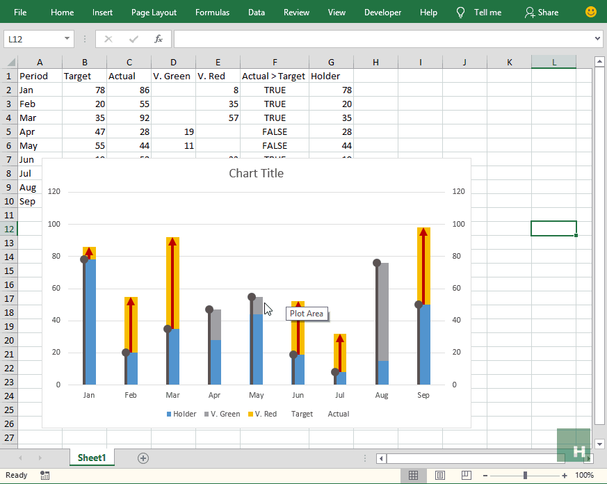
 Step 6: Click on Target series to select > go to design tab > click add chart elements > select standard error.
Step 7: Right-click on the error bars > click format error bars. From the bar on the right > under direction click minus. Under end style > select no cap. Under error alignment click percentage > enter 100 in the input box and press Enter key.
Step 8: Having error bars still selected > click fill and line icon in the right bar. Change width to 2.75 pt. Change begin arrow type to oval arrow.
Step 9: Select the target series and from format tab change shape fill to no fill.
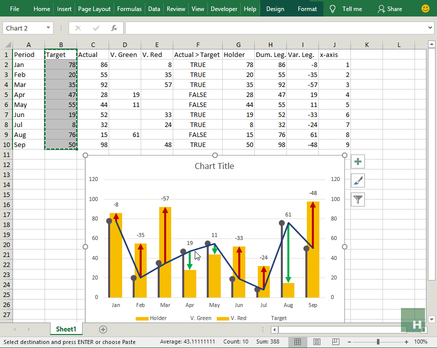
 Getting arrows in Excel variance chart
Step 1: Click V. Red series in chart to select it > go to design tab > click add chart elements > hover over error bars and select standard errors.
Step 2: Right click on error bars just inserted > click format error bars. From the bar on the right click error bar options icon at the top and make the following changes:
direction: click minus
end style: click no cap
error amount: click percentage and in input box type 100 then hit Enter key.
Step 3: Having the error bars still selected click fill and line options. Change color to red or whatever you deem fit for unfavourable variance. Increase the width to 3pt. Change begin arrow type to arrow.
 Step 4: Click on V. Green series in the chart > go to design tab > click chart elements > hover over error bars > select standard error.
Step 5: Right-click on to select the error bars just inserted > select format error bars and make the following changes in the right bar:
direction: click minus
end style: click no cap
error amount click percentage and in input box type 100 and press Enter.
Step 6: Click fill and line in the right bar with error bars still select and make the following changes:
Color: green or whatever you deem fit for favourable variance arrow
Width: 3pt
End arrow type to arrow
Step 7: Click on V. Green series again to select it > go to format tab > click shape fill > click no fill.
 Step 8: Right anywhere empty inside the chart > select format plot area. It will open up bar on the right. Click the drop-down arrow at the right of Plot area options and from the list select holder series. Go to format tab > click shape fill > select the same color as you selected for V. Red series to match it up completely.
 Configuring chart elements
This step is optional and you can skip if chart is already the way you like.
Mine has few quirks like target bar misalignment, actual bar too thin for my liking etc.
To have target lollipop aligned right on the edge of the actual bar, right-click just a little to the left of target lollipop in the seemingly empty area to select target series > select format data series. Change the following:
Series overlap: -20%
Gap width: 0%
From the bar on the right-click the drop-down menu with series option heading and select holder series and make the following changes:
Series overlap: 100%
Gap width: 100%
 Managing data labels for Excel variance chart
By now we have fully worked and flexing variance chart that is not just amazing to look but also fulfills the purpose so precisely that you can get the idea gazing at it just once.
However, something really important is missing. NUMBERS!
Though we can get the idea of what each series might amount to but our chart can be more efficient with numbers to each series.
This is where chart data labels are used. It looks like a simple thing as one can insert it via chart elements under chart tools tab but this isn’t working in this chart:
So we need to work around and this is where you are going to learn how to excel at Excel labels to make awesome charts 🙂
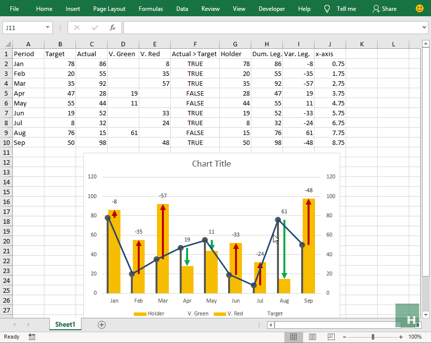
Customizing Excel chart labels – Label the way you wanted!
Labels for actual series bar
Our actual bar is actually a stacked column. Problem with the stacked column is that it only shows the labels inside the column which is not legible enough to my taste. Have a look:
Ideally, it should be above the column. For this, we will have to add dummy series plotted as line chart just for this purpose. But before we can do it we need data for it.
Step 1: Go to cell H1 and give heading as Dum. Leg. In cell H2 put the following formula and double click fill handle to populate the whole range:
=IF(B2>C2,B2,C2)
Step 2: Select the column just added including data and heading and press CTRL+C. Activate the chart by clicking once anywhere in the chart and right click on any corner of the chart > select paste icon.
Step 3: Click on the newly added series > go to design tab > click change chart type > scroll down to find Dum. Leg. series in the list and change the chart type to line > click OK.
Step 4: Click on the line in the chart > go to design tab > click add chart elements > hover over data labels > click above. This will add the labels fetched from the series.
Step 5: Click on the line again if its not already active > go to format tab > click shape outline > click no outline.
 Step 6: Go to cell I1 and give heading Var. Leg. and for cell I2 and down put the following formula:
=IFERROR(IF(D2=””,-E2,D2),””)
Step 7: On the chart, right-click on the actual bar labels > click format data labels and check value from cells and select the data range I2:I10 that we just created. Click OK.
Step 8: Uncheck boxes other than value from cells.
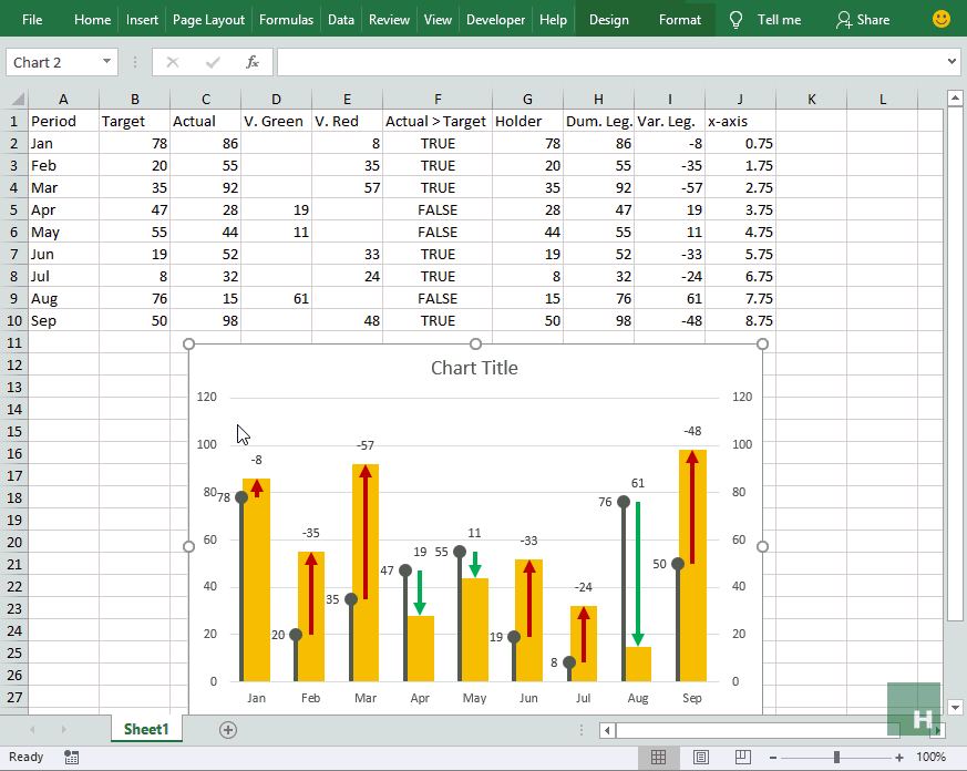
 Labels for target series lollipops
We can easily add labels to even error bars in Excel. And even for target series in our chart, it is possible like this:
However, I am not liking how close the numbers of target series and variance arrows get. If we can manage the labels for targe series to the top-left that will make each label discreet to each series and easy to relate. For this we need to take help of scatter with straight line chart.
Step 1: Go to cell J1 and give heading X-axis and fill the column with 1,2,3…, till 9.
Step 2: Select target series data range, heading included, hit CTRL+C to copy > right-click over chart > click paste icon to insert a new series in chart. You might not be able to see it but don’t worry.
Step 3: Having chart active go to design tab > click change chart type > scroll down to locate the target series at the end of list > change chart type to scatter with straight line and click OK.
 Step 4: Right-click on the line that is now visible > click select data. This will open up a box > scroll down the list and click on target series to select it > click edit button.
Step 5: Edit series box will pop up > remove everything in the series X values input bar > select the data of x-axis column excluding heading. Click OK and OK.
Step 6: Now we want to align the start of line exactly at the center of round head of first lollipop. In the current scenario, 0.75 gives the appropriate alignment. Now just add 1 in every next cell i.e. 0.75, 1.75, 2.75, 3.75,…,8.75. This will align the line with the heads of target series.
 Step 7: Click the line once to select it > go to design tab > click add chart elements > hover above data labels > click left. This will insert the labels for target series.
Step 8: Having the line still selected go to format tab > click shape outline > click no outline to hide the line.
 Labels for actual series bar
Step 1: Right click on the chart > click format chart area. From the bar on the right > click drop-down arrow and select Holder series > go to design tab > click add chart elements > hover over data labels > click inside base.
 Step 2: Right-click on the data label just inserted > click format data labels > check value from cells and select the range of Actual series from the Excel sheet excluding header > Uncheck other boxes.
Step 3: Left-click once on the actual series data label > go to format > click shape fill > click more fill colors. From the color palette select white shade and adjust transparency to 50%.
 Getting rid of unwanted chart items
Simply left click once on the following items and press delete key on the keyboard:
- Chart title
- Right and left vertical axes
- Major gridlines
- Legends

And here it is in all its awesomeness flexing as the dynamic data updates:
Download fully worked Excel Variance Chart Template
 And yes file is completely unlocked. Nothing hidden. All available for you to modify and change.
Got a question? Contact details are here
Hey, thanks for this, it’s really helpful! What happens if the actual is positive and the target is negative or vice versa? I’m trying to plot a chart with these parameters and it looks odd.
Feast to Eyes
Remember the old “Onida TV” AD. This chart is – “Neighbour’s envy”
Pride for the presenter of this chart
thanks a lot
I am wondering how will the plotting work, for some of the targets which may have been achieved before time. E.g. for the month of Jul the target was 226 and the actual was 219. So the chart will show a deficit in meeting the target by 7 points but what if this 7 may have been completed earlier in month of June. So ideally it not a deficit.
Thanks a lot
Hello I purchased your Variance Bundle but why am i getting a .rar file?? Please let me know if I should dispute/cancel with payment
Simply awesome. A different approach to display chart of Actual vs. Target. Thank you very much for spreading the knowledge. JAZAKALLAH.
So great. Thank you so much