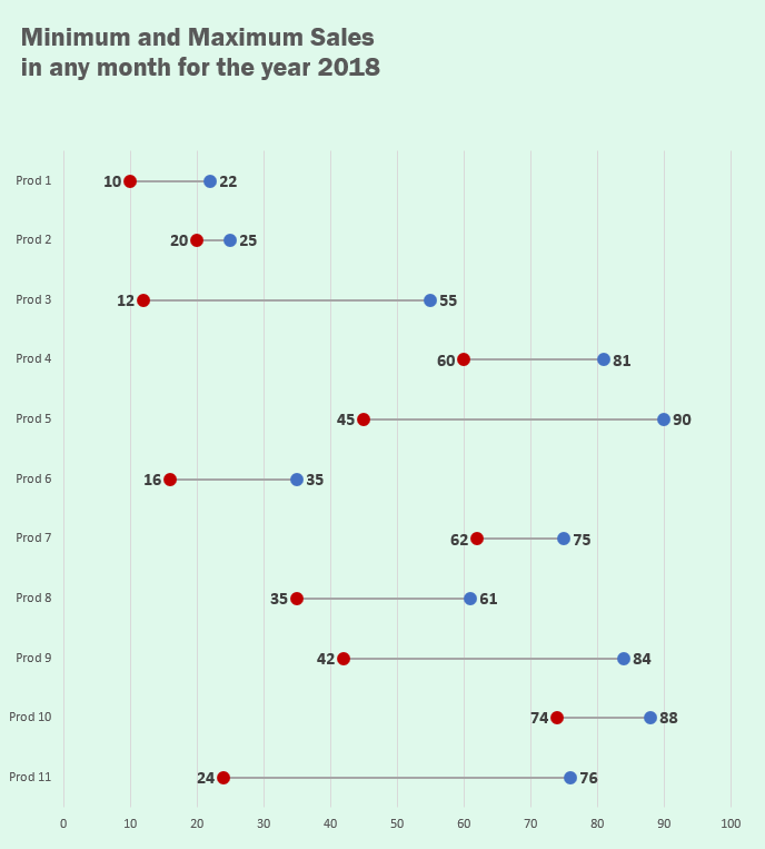
Dumbbell charts also called connected dot plot or DNA chart or lollipop charts are not available as builtin charts in Excel by default. But they prove awesome visual aid in certain situations. A great alternative to conventional clustered bar charts as they save space and keep the competing values in the same line.
Here is an example comparing minimum and maximum sales of different products during the period:

I’m not really sure but so far every tutorial I have come across uses some kind of complex method or uses scatter chart to make dot plots in Excel. Well they have reasons but today I am attempting to make fully functional and working dot plot using bar charts! Yup dot plots are meant to replace them so why not! So lets start!
Dot Plot / Dumbbell / Lollipop / DNA Chart in Excel – Step by step
Step 1: Download the Excel workbook that contains dummy data so that you can follow along and learn the techniques applied in this Excel tutorial.
Step 2: Have an active cell inside the range and hit CTRL+A to select the whole data and go to > insert tab > under charts group click insert column and bar chart button > click clustered bar chart. This will insert the chart as following:
Step 3: Having the chart still selected go to design tab > click change chart type under type group > from the pop up box select combo from the list on the left and make the following changes:
- new series change chart type to clustered bar and select secondary axis
- old and delta series change chart type to stacked bar
You might have to juggle the chart type few times as you make the changes so have the correct chart type before you press OK. Once done your chart will look like this:
Step 4: Having the chart still active go to design tab > click add chart elements > axes > click enable secondary vertical axis.
Step 5: Right click on the left vertical axis > click format axis > from the bar on the right click on axis options icon > under axis position tick select categories in reverse order. Do the same for the vertical axis on the right.
Step 6: Delete the bottom horizontal and right vertical axis by simply left-clicking once and hitting delete key on the keyboard. Now we have the series plotted in the correct order.
Step 7: Click on the only visible series which “New” > go to design tab > click add chart elements > error bars > click percentage.
Step 8: Having the series still selected > go to format tab > click shape fill > select no fill.
Step 9: Right click on error bars > click format error bars. From the bar on the left Making the following changes:
- Direction: Minus
- End style: No cap
- Error amount > Fixed value: 0.1
Step 10: Click Fill and Line icon > change the color to your liking, I chose blue. Increase the width to 2.5 > change begin arrow type to oval arrow.
Step 11: Click the downward arrow to the right of Plot Area Options > select “Delta” series > go to design tab > click add chart elements > error bars > click percentage.
With series still selected go to format tab > click shape fill > click no fill.
Step 12: Right click on the just inserted error bars > click format error bars and make the following changes:
- Direction: Minus
- End style: No cap
- Error amount > Percentage: 100%
Step 13: Select old series from the drop down arrow > go to design tab > click add chart elements > error bars > click percentage. With series still selected go to format tab > click shape fill > click no fill.
Step 14: Select old series error bars from the drop down arrow and make the following changes:
- Direction: Plus
- End style: No cap
- Fixed value: 0.1
Step 15: Click Fill and line icon and change color, I liked red. Change width to 2.5. Change begin arrow type to oval arrow.
Data labels for Excel dot plot / dumbbell / DNA / Lollipop chart
Now that we have a finalized chart, we can add more value if we have data labels with each dot. This was a challenge but the we have approached the chart, its super easy now.
Step 1: Select old series from the drop down arrow > go to design tab > click add chart elements > data labels > click inside end.
Step 2: Add the data labels for “New” series as well using same method but having them placed at outside end.
Final Touches – Excel dot plot / dumbbell / DNA / Lollipop chart
Get rid of legends at the bottom by left-clicking and hitting delete key on the keyboard. To bring the x-axis down right click on the axis > click format axis > click labels > from the drop down select high.
And finally with background of the chart colored and appropriate chart title we have the following result:

Loved it? Pin it!


Simply great. an alternate method of displaying the Actual vs. Target chart. I appreciate you sharing this information.
So easy to follow! I love it – thank you so much for sharing.
Hasaan,
Thanks for your great lessons. they are really nearly not at anywhere else
Following the steps becomes quite impossible for me because the process runs at near lightning speed. I got lost at Step 7. Can you kindly provide a more relaxed edition for me to be able follow or one that can be downloaded?
Harrison
Hi Hasaan
Seems to be great work.
Will you publish a file for downloading ?
Rene