Last time we learnt how to make simple dial charts. There is so much to be discussed as basics to Excel charting but without little fun and doing out of ordinary is what everyone asks for. So today we will talk about how to do conditional charting in Excel.
Making things clear, there is no feature in Excel as yet to give you conditional formatting for charts (dubbed as conditional charting). The conditional formatting we have is only limited to cells. If this feature is added it will make Excel dashboards way cooler than at the moment possible. So for now we are going to use one workaround to achieve it.
For those who are new to conditional formatting in few words its a feature that let you make content change colors as values change. As said above so far it is limited to cells only and we can make cells change fill color as the value inside that cell changes. As an example you can check Birthdate heat map article.
Basic Idea with Basic Data
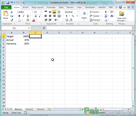
I have a simple data in hand. Usually sales department settle targets for the month and at certain day of the week supervisor monitor the achievements. With the same idea in mind we have the data of sales target and actual sales achieved so far in terms of target with variance. All figures are expressed in percentages.
This is the same concept we utilized to make dial charts. But today we are adding a little twist to it. What we want to do is let’s say if actual sales are less than 50% of standard or target then graph should be in red color. And if actual sales exceed 50% then show the graph in green or blue color.
With a little more tuning to pie charts or dial charts we can make speedometer charts but this is for the future 🙂
Understanding the workaround
As I said earlier there is no feature in Excel that let you do conditional charting, although there is conditional formatting but that is limited to cells.
If you have grabbed the basics of charting then charts are plotted using the data and if there is no data, there will be no chart! And this is exactly our workaround 🙂
We are going to make two separate charts from two different derived data series. The reason I am saying that two series are derived ones because both of them will be linked to basic data of target, actual and variance.
With functions in action, we will make one series getting populated if actual results are less than 50 but the other series empty or 0. And if the results go 50 or above then the second series will populate and the first one will be turned 0 or empty.
If we make the charts using these two series then at a time only one chart will be visible and the other will be empty. Moving one chart area over the other we will get our effect of conditional charting. This is called layering in actual terms or masking or overlapping charts or whatever you like to call it.
Didn’t get it? No problem read on to understand 🙂
Prepping Data – Step by Step
Open the file you downloaded and follow these steps:
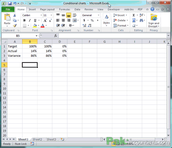
Step 1: Paste the following formula in cell C1 and press Enter:
=IF($B$2<50%,B1,0)
Step 2: Double click the fill handle so that formula is copied down to third row.
Step 3: Select the values in column C and press Ctrl+Shift+5 to make raw numbers to show up as percentages. Following animation shows how to carry out all the above steps:
Step 4: In cell D1 put the following formula and press Enter:
=IF($B$2>=50%,B1,0)
Step 5: Double click the fill handle to paste the same formula down to third row.
Now you can see one series exactly same as Column B and the other all ZERO. If you put any value 50 or above 50 in cell B2 then the first series will turn all zeroes and the second will populate with the values as in column B. Following animation shows the effect:
Making Charts – Step by Step
Step 1: Select the values in column C and go to Insert tab > charts group > click pie charts drop down and select the very first option under 2-D pie.
Step 2: Repeat step 1 but this time selecting the values in column D.
You will get two charts but one with pie in it and the second one is empty. To resize hold down Shift key on the keyboard and with your mouse drag the corner of one chart. Do the same with the second. I size them same by matching borders. It will help me later get the best results. Following animation walks you through steps:

Step 3: Select the legends in both charts and press delete key to make only pie visible.
Step 4: Click the pie chart once and press right mouse button (right click) once. From the menu select format data series. A new window opens make sure series options tab is selected and under “angle of first slice” rotate it to 90 degrees. Click close button. Now you have pie rotated in a way that the color filling pie half is at the bottom.
Step 5: Click the blue area once more after the chart is selected. Press right click and from the menu select format data point. In the window on the left click fill tab and from the right select no fill radio button. Click Close button
Step 6: Click the color at the right of pie (in my case it is green). Make sure only that portion is selected, right click and from the menu select format data point. In the window, click fill tab on the left and from the right select no fill radio button. Click close.

Step 7: In the cell B2 type 55 and press Enter. Now the chart you just formatted will disappear and the chart area on the right which was empty before now has a pie.
Step 8: On this chart that just appeared repeat steps 4 to 6 to format it like a dial chart.
Step 9: As we want chart to be in blue color if actual value is 50 or more therefore, click the only visible portion of pie and make sure only that is selected > right click > format data point. In the window that appears on the left click fill tab. From the right click solid fill option. From the fill color palette select any shade of blue. In my case blue color was filled the moment I selected solid fill button. Click close. Following animation will help you carry out these additional steps:

Step 10: Now move one chart area over the other by simply click anywhere in the chart area and dragging it. Drop it by releasing the mouse key once at the right place.
Step 11: Right click anywhere outside the chart i.e. white area. Click format chart area and on the right select no fill radio button.

Step 12: Celebrate!!!! 🙂 But before you start jumping test its working by changing the values in cell B2 by putting any value less than 50 and then putting any value above 50. Chart will be red if value is less than 50% and it will be blue if it is more than 50%.

You deserve a massive celebration here! As you have excelled at one of the unique workaround to get chart change its color by changing the values