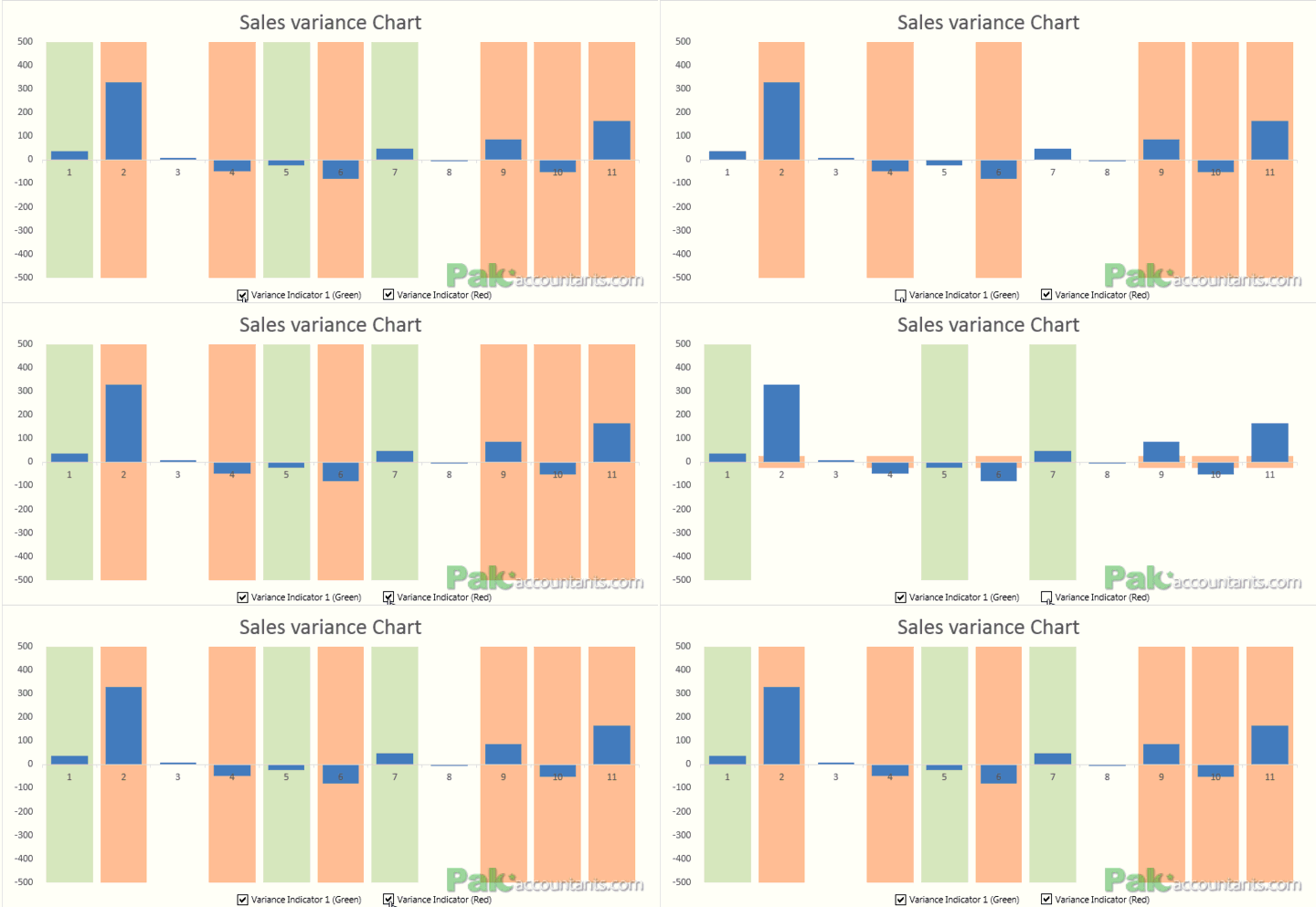
Highlight instances in Excel charts in different colors with shaded bars in background
Suppose you have a variance chart and want to highlight those that require inquiry. Further suppose that you have two levels of inquiry:
Variances that require moderate inquiry (highlighted by for example green color)
Variance...
Conditionally Format Chart’s Background in Excel – How To
Excel charting is in the air for last few weeks and we are learning some really cool tricks on making charts better looking and also fulfilling the purpose. Today we will learn how to...
Excel chart of Top / Bottom “N” values using RANK() function and Form controls
Ever fancied that you have large set of data and from it you can have a chart of top or bottom N values and better yet you have the ability to switch between chart...
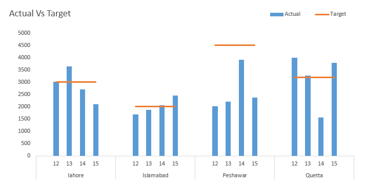
Excel Actual Vs Target – Multi type charts with Subcategory axis and Broken line...
Last time when we learnt about multi-category axis we saw how meaningful chart can become. But today we are going to add in more flavours and ingredients to it and by the end of this...
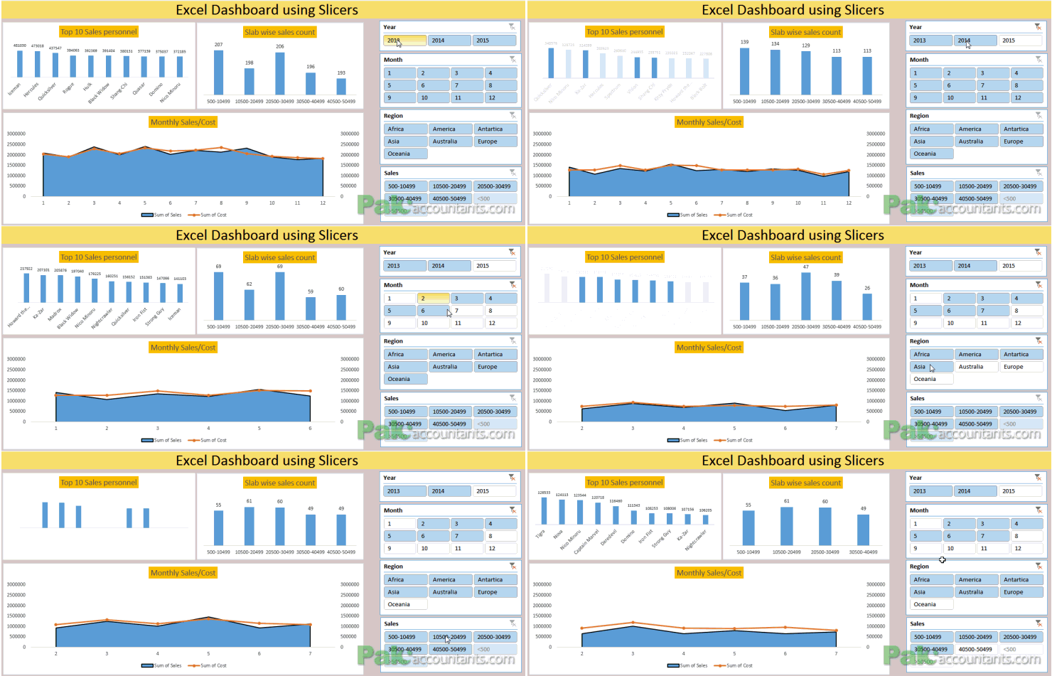
Making Sales Dashboard using Excel Slicers – How To
So many reasons why not to hate Excel dashboards. They are beautiful, they are dynamic, they make everything super easy to understand. And not to mention it one cool way to grab attention at...
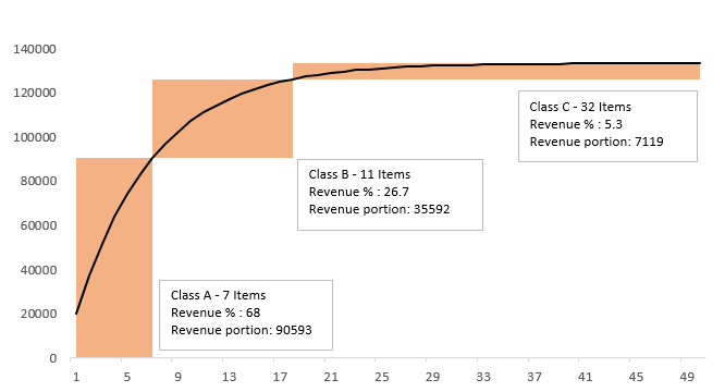
ABC Inventory Analysis using Excel Charts
Earlier this month we learnt how to carry out ABC inventory analysis in Excel using conditional formatting technique. It was easy and we had loads of fun as we not only understood how to...
Create Excel Charts with Bands or Threshold in the background – [How To]
Just the other day I was teaching my ACCA F5 students about variance analysis and there we learnt that not every variance needs to be investigated and only those should be probed that breach...
Creating Excel charts with Subcategory axis – [Quick Tip]
This is definitely a neat trick. Usually we have single X-axis chart element. But you can have multi-category axis to show the information in a much more arranged manner. Following is what we are after....
Custom Data Labels with Colors and Symbols in Excel Charts – [How To]
Is it possible to have colored data labels like red for negatives and blue or green for positive values inside excel chart? This question was asked by some when I posted Variance Analysis in Excel – Making better...
Creating Scrollable Charts in Excel [How To]
Last time we discussed on how to have a subset of data within worksheet that scrolls independently and I called it scrollable data ranges. It was fun as we involved one of the Excel...


![Create Excel Charts with Bands or Threshold in the background – [How To]](https://pakaccountants.com/wp-content/uploads/2013/05/excel-tips-and-tricks.png)
![Custom Data Labels with Colors and Symbols in Excel Charts – [How To]](https://pakaccountants.com/wp-content/uploads/2014/09/data-label-chart-1.gif)