To get the inspiration for better charts and Excel dashboards one must be observant of such pieces of information that are often found in newspapers and the internet. For that matter, Pinterest and The Economist are my routine sources of inspiration among several others. This is why today we are learning to make waffle charts in Excel!
Recently I stumbled on the following chart on the website of journalism.org:
I like the way information is presented here and can add meanings to any excel dashboard report. For example if you want to report expense burden on total income and also which of the expenses is contributing the most. Then it sure is a cool way!
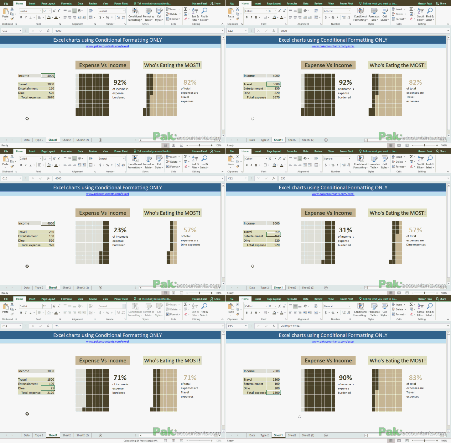
So I tried to get the same result in Excel using conditional formatting. Yes! a chart using conditional formatting using simple cells and here is the result:
Got a question? Contact details are here
Liked it? Well I liked it a lot and can’t wait to use it in dashboard report as I am expecting it to look super cool.
It might look difficult to make but is super easy if you know the basics of conditional formatting. Don’t worry following steps explain the whole process simply following along and you will have your own chart in a minute or two!
Making Waffle Charts in Excel – Step by step
Step 1: List your income and expenses. For my example, I have an income figures in one cell and three other expenses and their figures.
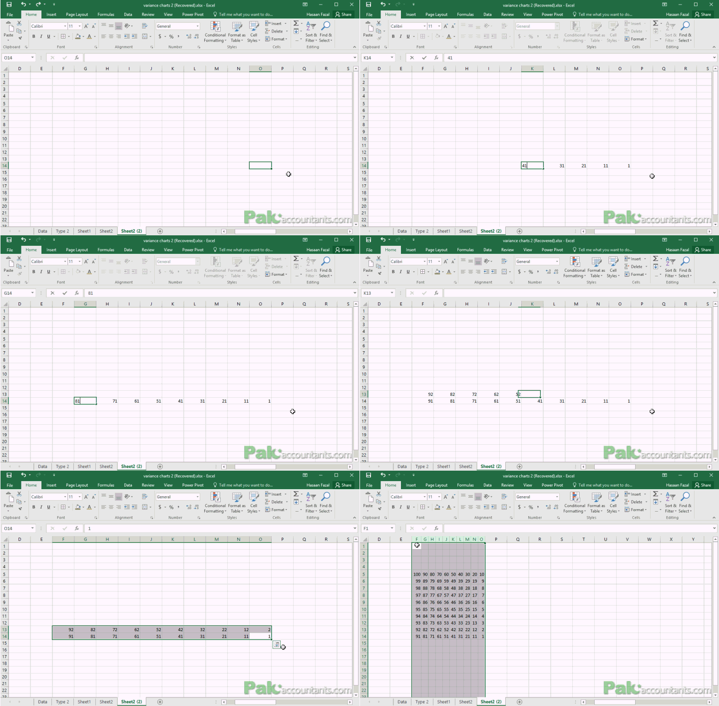
Step 2: This is the important bit. You need a box of 1-100. 1-10 in one row, 11-20 in the second, and so on until you have 100. This will help us conditionally format the cell later.
Step 3: Make a few calculations like:
Expense / Income %: For this, you simply have to divide the total of expenses over income. I had the following formula in place to calculate the percentage:
=ROUND(C10/C5,2)*100
Highest expense % out of the total expenses: We need to determine which of the expenses is the highest and the percentage of it out of the total expenses. For this I used the following formula:
=ROUND(MAX(C7:C9)/C10,2)*100
Fetching the name of highest expense: We not only need the percentage of highest expense out of the total but also its name so that if data changes, the relevant name is fetched accordingly. For this I used INDEX and MATCH combo as follows:
=INDEX(B7:C9,MATCH(MAX(C7:C9),C7:C9,0),1)
“Secret sauce”: You see in the chart above, the highest expense percentage number is on the basis of total expense figure. However, the chart area is based on income. So we need to calculate the percentage of highest expense against income to present the right proportion in boxes. For this I used the following formula:
=ROUND(MAX(C7:C9)/C5,2)*100
So we have the basic data prepped up! Time to bring conditional formatting into the action!
Step 4: Make a box of 1-100. We will use it for logical test and to apply conditional formatting.
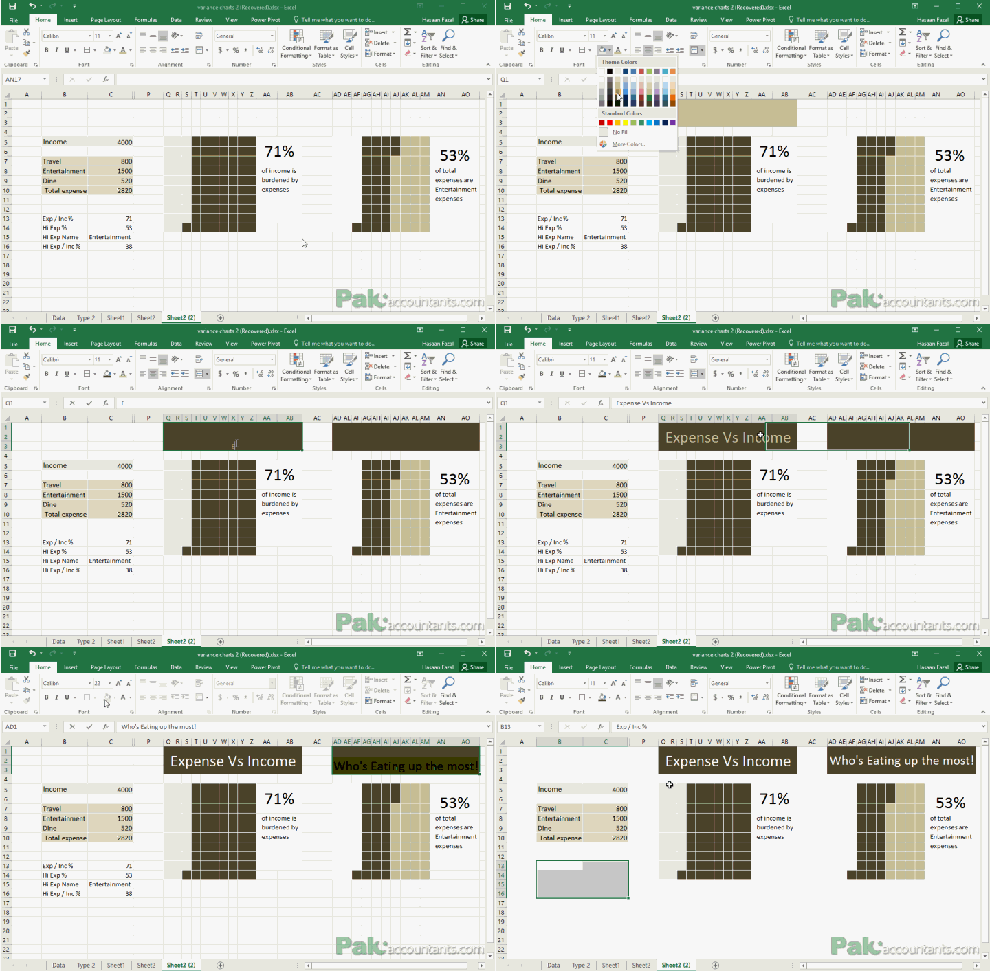
Step 5: I made few width and height adjustments to cells and some formatting to the Expense / Income quadrant.
Remember! the number of boxes that we will conditionally format should be equal to number of boxes in which we have 1-100 figures! So 100 boxes in total!
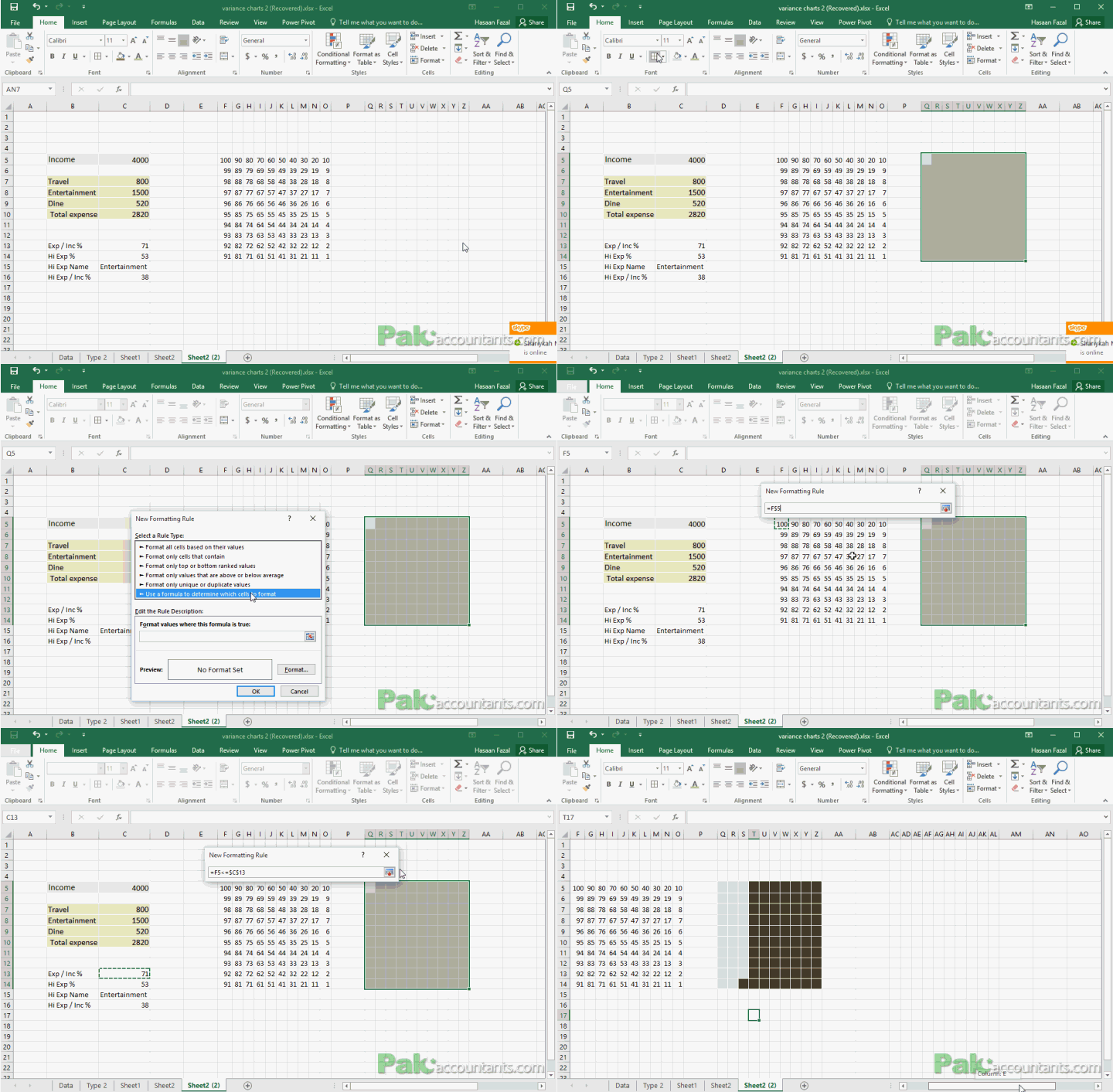
For Expense / Income percentage select the cells and go to Home tab > click Conditional formatting drop down button and select new rule > Select the last option from the drop down menu and put the appropriate formula in place. In my case it was:
=F5<=$C$13
In cell C13 I had the percentage of expense over income calculated. It is simply checking if the value in cell F5 is less than or equal to the value in cell C13. If true then it will format the cell otherwise leave it as is. I chose a fill color that desired and click OK and apply.
Step 6: For Highest expense % out of the total expense you need to insert two conditional formatting rules. Again Select the cells and go to conditional formatting options as stated in step 4.
First rule formula will be the same as in step 4 to mimic the total expenses:
=F5<=$C$13
Click OK and click New rule button and again go the last option in the dialogue box and now put the appropriate formula so that percentage of highest expense out of total area is presented faithfully. In my case the formula was as follows:
=K10<=$C$16
Whereas cell H12 has the percentage of highest expense against total income. Once the formula is in place and formatting selections done. Click OK and APPLY to see the effect!
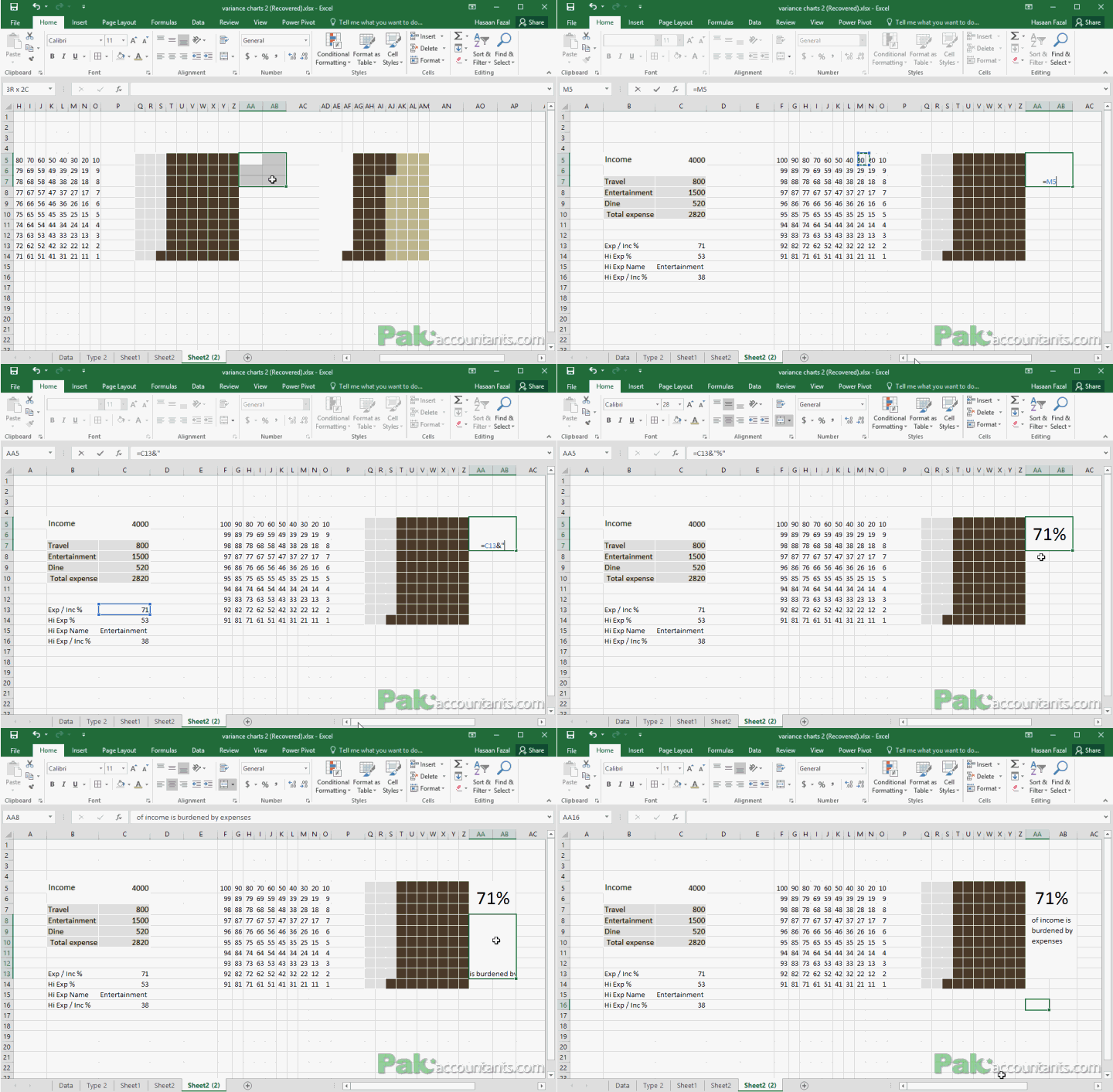
Step 7: Lastly to add information bits on the right of each graph:
For the first quadrant: I simply fetched the value of percentage from the cell for Expense / Income % and added a description myself.
For the second quadrant: The figure is simply fetched with cell reference. The description is a little tricky as expenses figure may change and the highest expense may be different. So I used a simple concatenate shortcut using the following formula:
="of total expenses are "&C15&" expenses"
Once done, I hid the grid lines and headings and also few columns that are there for back end working to make it look cleaner.
Here is the final result all set up and working as intended:
Got a question? Contact details are here
I really enjoyed making this tutorial. Its a new way of making conditional charts without using chart tool. And I am sure this can be used pretty effectively in dashboard reports in many different ways.
Let me know in the comments to this post how you would like to see this chart in action or if it really worth this much of effort at all.







I decided to fiddle with a company’s income statement that consisted of three years. The formula you used, =INDEX(B7:C9,MATCH(MAX(C7:C9),C7:C9,0),1), is for only one column. How would I construct this formula using three columns? I tried =INDEX(B12:E20,MATCH(MAX(C12:E20),C12:E20,0),3) but I get an N/A error message. I know the answer is right in front of me, but I don’t see it.
One option I came up with was, I created a 3-year total column and use the figures from this column in the calculation. This actually worked. But, I still wonder, is there another way to use the three columns? I suppose by using VLOOKUP, but would like your key insights.
Ausum, I have given this in my financial dashboard, Truly Amazing!
I would never guess this was made in Excel – great work!