Charts and graphs and other visual means make information easier to understand and analyze. Excel gives plenty of options in this department as different types of graphs are possible.
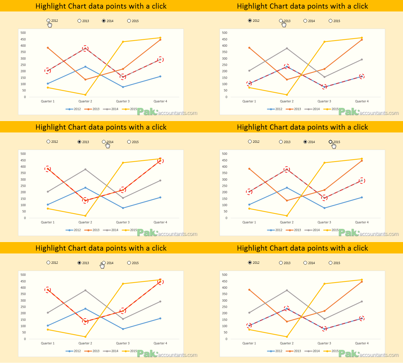
But in some cases wrong chart types in the situation impair chart’s visual effectiveness. For example in case of line chart with many data points it may become difficult to trace which data point is related to which series. One way to overcome this problem is to dynamically highlight the data point as follows:
The original idea for this chart came from the post by Sumit on his Excel blog. I really liked it but he used VBA method to get the job done which is also good. But I will be using non VBA technique using Excel form controls and it will save you lots of coding know how and not to depend on codes every time. So I hope my technique will help even those Excel users that are not versed in VBA coding.
Highlight Data points – Step by Step
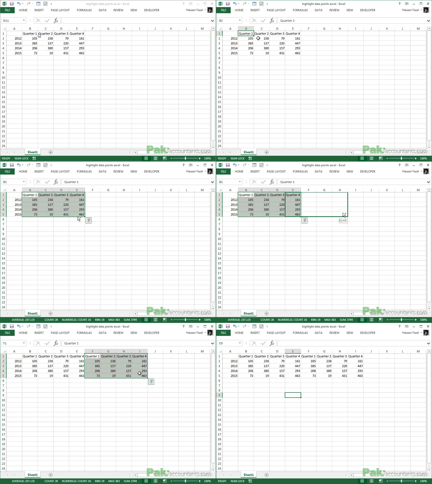
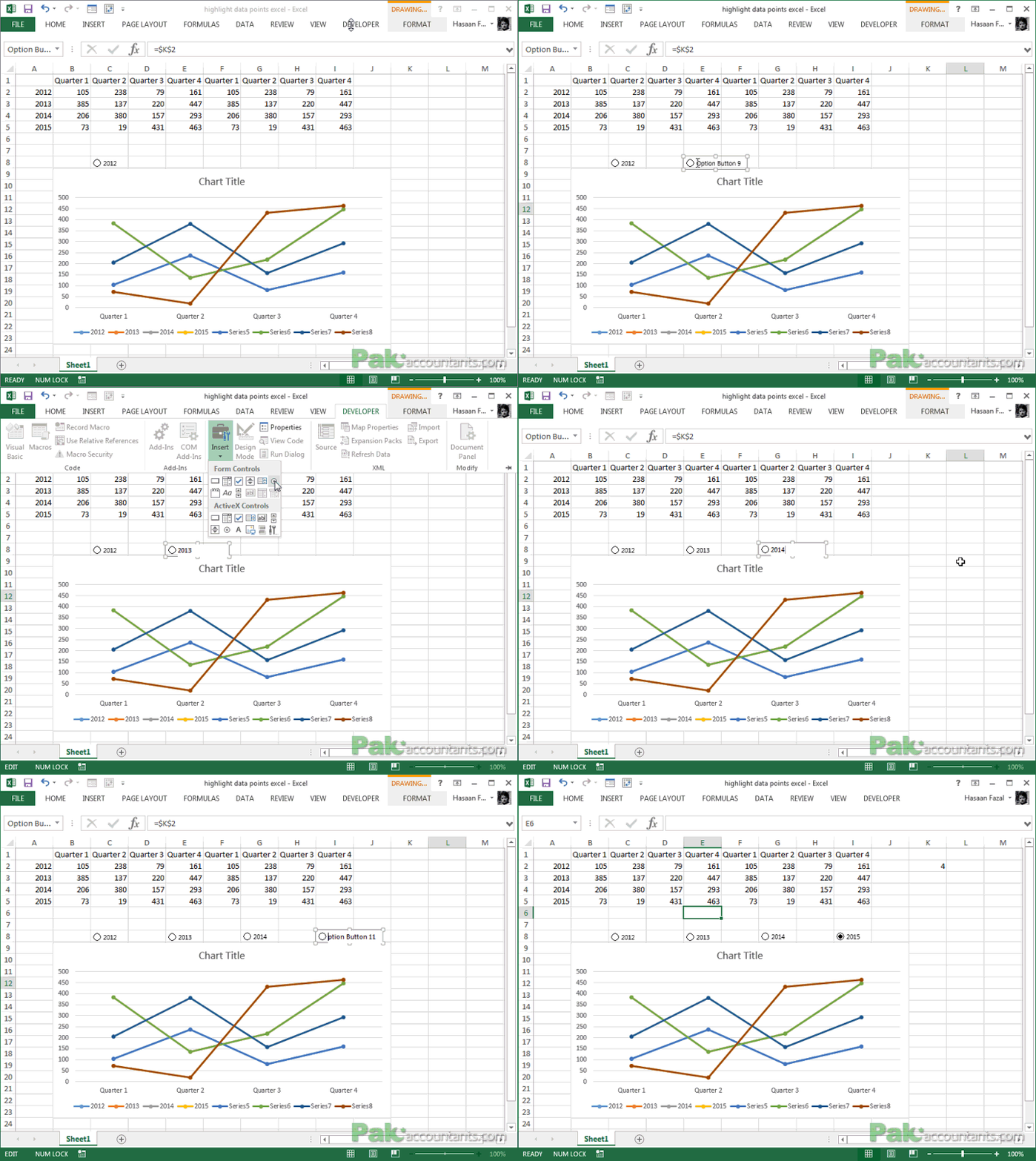
Step 1: Download the tutorial workbook and open it. And immediately copy the data by selecting the range and then pressing and holding CTRL key down and moving the selection box to the right.
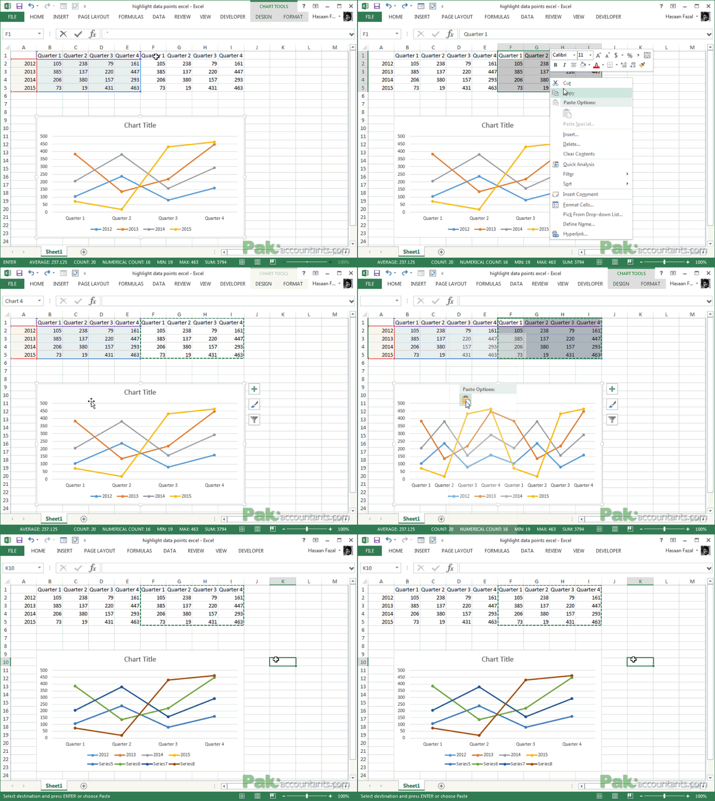
Step 2: Select the initial range and insert line chart with markers by going to Insert tab > Charts group > Line chart button > click line chart button with markers
Step 3: Now here is the ingenious part. Copy the second range of data that you previously replicated and paste it on the chart. Yes on the chart! not anywhere in the worksheet.
Did you see what just happened? Excel has inserted another data series right over the previous one.
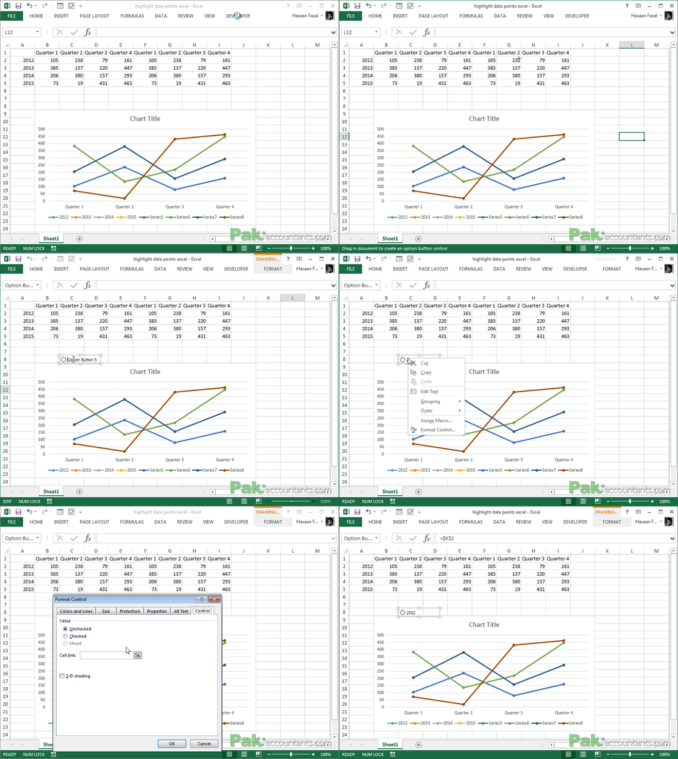
Step 4: Time to insert buttons. Go to developer tab > Controls group > click Insert drop down button > click option button. The cursor will change to plus sign. Click anywhere in the worksheet to insert the button. Right click on the button and click form control. In cell link box mention the cell you want to connect to this button. I chose K2.
Step 5: Now insert three more buttons following the same process as mentioned in Step 4. In my case all the next three buttons were by default connected to cell K2.
We need four buttons because we have four years i.e. 2012, 2013, 2014 and 2015. Change the text of each button accordingly.
To check if buttons are working appropriately you can do so by clicking each button and seeing if the value in cell K2 changes on click.
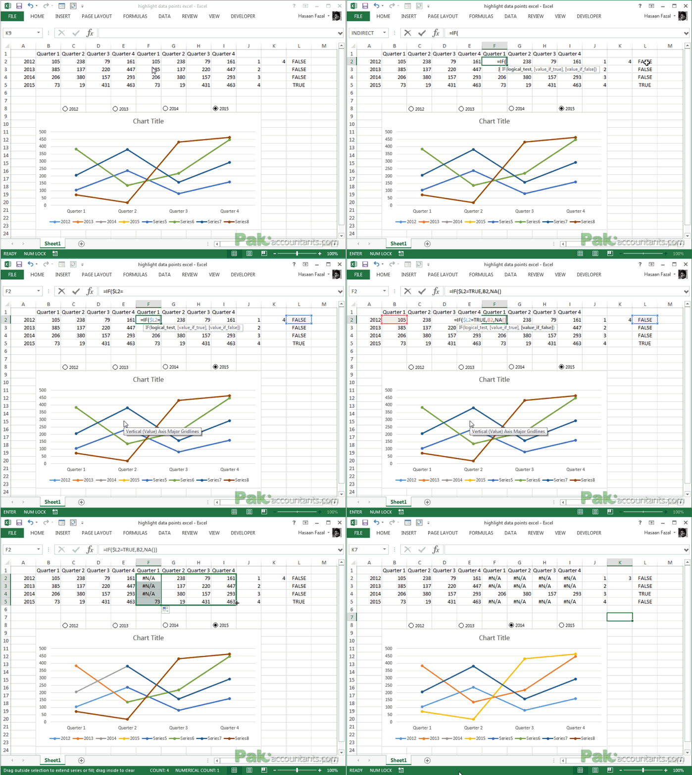
Step 6: In column J from cell J2 to J5 put a series of number from 1 to 4. And in cell L2 put this formula and drag the fill handle down to cell L5.
=$K$2=J2
Step 7: Now go back to cell F2 and after deleting existing content from the cell paste this formula:
=IF($L2=TRUE,B2,NA())
Drag the fill handle down to cell F5 and then dragging it again across to column I to right.
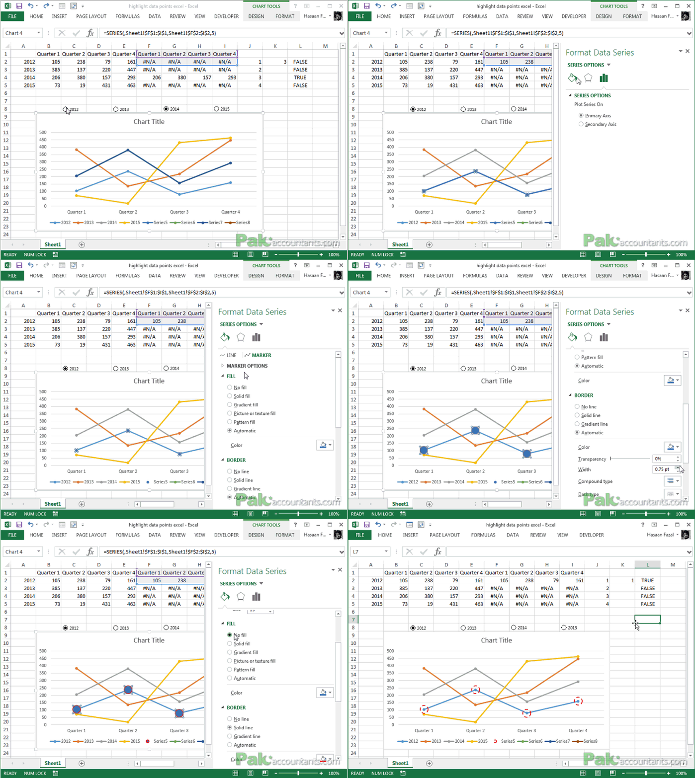
Step 8: Click 2012 button and right click on the relevant data series in the chart. Click Format data series. And make the changes to line and marker as shown in the animation below:
Do exactly the same with other three data series. Once done you will have the chart like this:
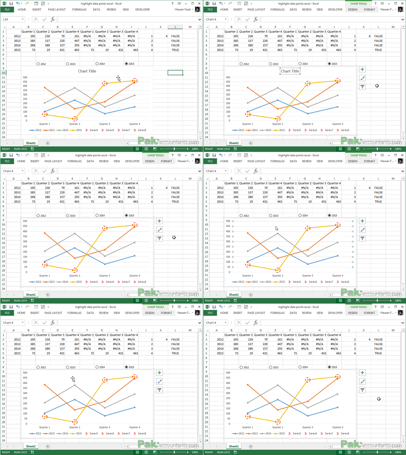
Step 9: Clear out the unnecessary elements in chart by left clicking them and hitting delete button on the keyboard like chart title etc.
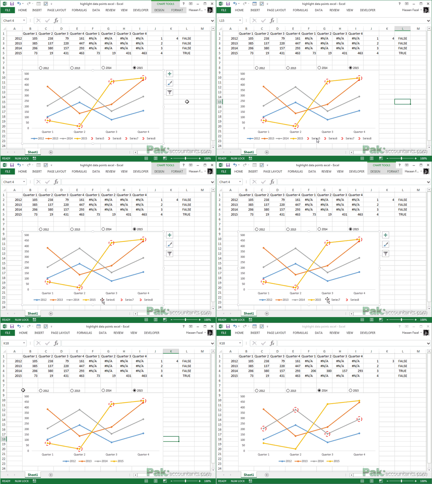
Step 10: In legends we have the legend marks of second series we inserted too. To get rid of them simply click each legend twice with left mouse button and hit delete button.




Very Nice
On step 8, when i right click 2012. The option for format data series is not poping up. Therefore i can only go upto step 8.
YOU are a magician!
When I paste my duplicated data F1:I5 I get a graph with Quarter 1 – Quarter 4 duplicated as you do. With 1 click, you then magically end up with only 1 set of Quarter 1 – Quarter 4 – HOW???