Today we are learning how to create project timelines or project timeline charts in Excel. One can say that timeline charts are simpler versions of gantt chart as they usually don’t involve activity’s stage of completion. Project timelines are usually prepared at the start of project to understand the flow of activities and which task is followed by what sequence. It is usually presented before any detailed analysis of activities and their duration is available so that management can align its complimentary activities well in time.
And this is exactly what we are learning today. Yes! How to create project timelines or timeline charts in Excel:
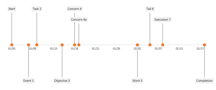
It is definitely a cool chart and loved decoding it the template. So in this tutorial we will learn how to make this or similar chart and in my next installments we will learn how to turbo charge it with more features to make it even better.
Understanding the basics
Timeline is a visual list in which events are show in chronological order on a straight line depicting time. Time can be in any unit, hours, days, weeks, months, years, decades, centuries and so on. This help understand what happens when and also the before and after events very easily.
Project mangers often use timelines in presentations and as a planning tool to streamline the different activities (often termed as milestones) that are needed to be carried out at specific dates. They are often called project timelines.
Looking at the chart we have two things:
- Time that is along x-axis
- Milestones that are plotted on y-axis.
We need to get data collected for these two elements. Once we have the relevant data only then we can proceed with charting. As I said time can be in any unit but it should be consistent i.e. use either days or weeks for all the events. It is not possible that you have few events in years, few in months and few in days as it can be possible as sub-events but this time we are keeping things simple and leaving sub-milestone plotting for another day.
As you can see some milestones are shown above the horizontal and some are shown below the horizontal line. We need to workout this as well.
Lastly we have a red dot at every data of milestone and then a vertical extending perpendicular to horizontal.
Making timeline charts in Excel – Step by step
Once understanding what we need, lets proceed with how to get what we need.
Step 1: You have the dates and milestones at the start of the worksheet in column A and B. I have the following data.
| Date | Milestone | M position | D position |
| 3/1/2014 | Start | 15 | 0 |
| 7/1/2014 | Event 1 | -15 | 0 |
| 9/1/2014 | Task 2 | 15 | 0 |
| 15/1/2014 | Objective 3 | -15 | 0 |
| 18/1/2014 | Concern 4 | 15 | 0 |
| 19/1/2014 | Concern 4a | 10 | 0 |
| 2/2/2014 | Work 5 | -15 | 0 |
| 5/2/2014 | Tail 6 | 15 | 0 |
| 8/2/2014 | Execution 7 | 10 | 0 |
| 18/2/2014 | Completion | -15 | 0 |
| 24/2/2014 | Ceremony | 15 | 0 |
To copy above data simply select it > copy and paste it in the excel worksheet. Go to cell C1 and put heading M position and in cell D1 put heading D position. Following animation will help you:

Step 2: Select the range (including the the additional two headings) and hit Ctrl+T. A new popup will appear, click OK and now the range is converted to Tables. This will make the range dynamic and if data later grows then any output on the basis of such range will also grow. We will see this in action later.
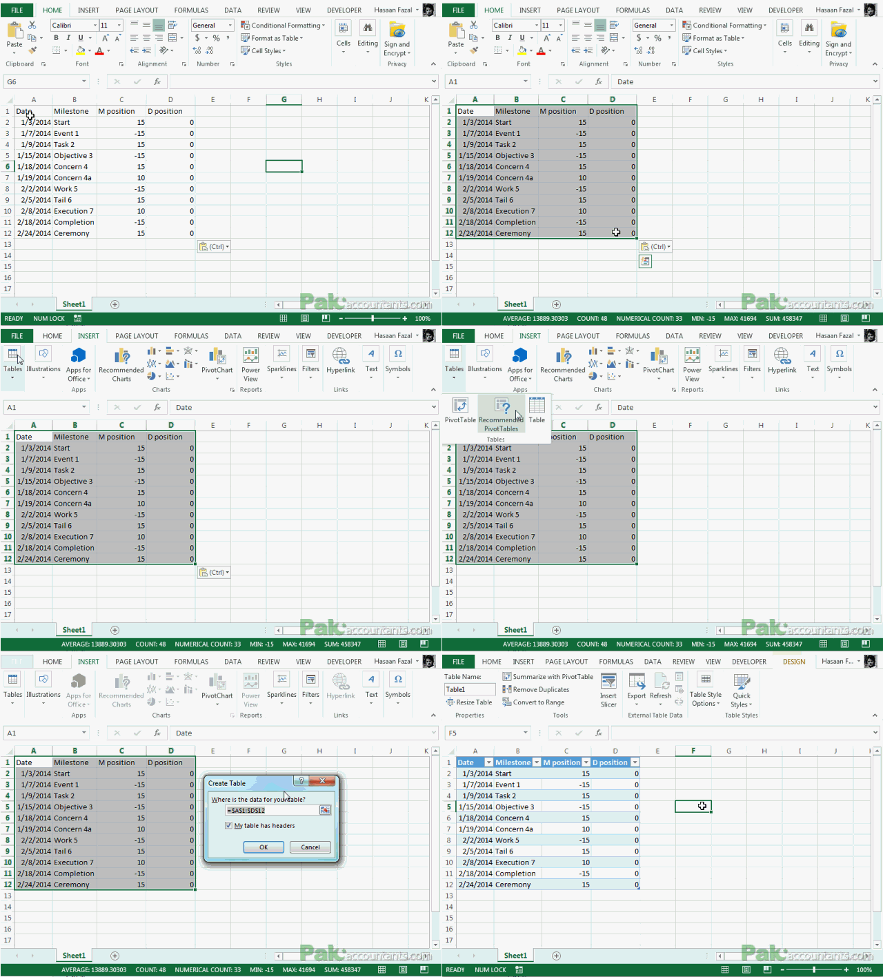
Step 3: Select the whole table with headings and go to Insert > chart group > Select clustered column. This will put in the basic chart we can work on.
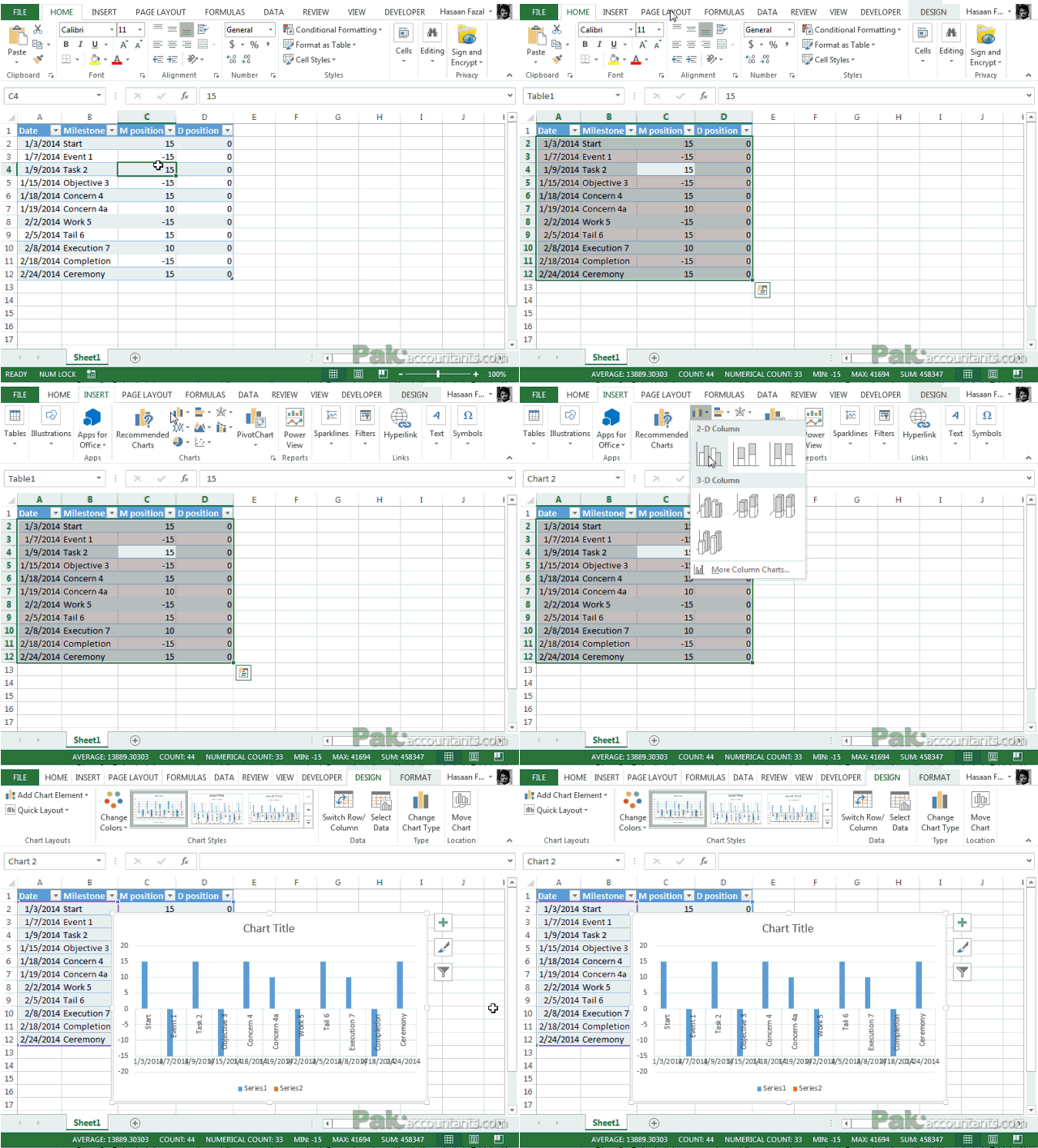
Step 4: Lets clear out few things for now. Click on chart title and hit delete key. Left click on legends and hit delete key. Finally click on vertical grid lines and hit delete key again. You will end up with the chart something like this:

Step 5: Having the chart selected go to Format tab under chart tools and from current selection group through drop down select M position hit format selection button. Have series overlap to be 0% and gap width to be 150%.

Step 6: Again go to format tab under chart tools and this time select D position. With the series selected click design tab under chart tools and hit change chart type button. In front of D position from the drop down menu select line with markers.

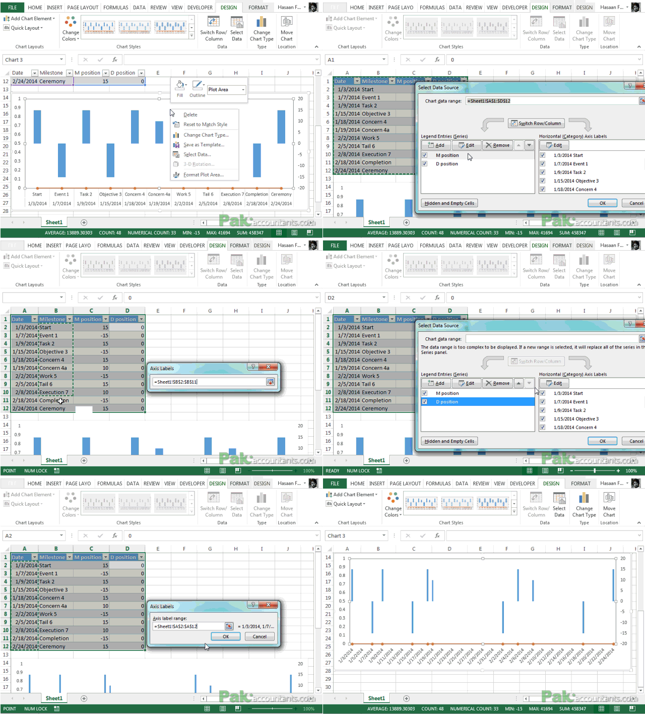
Step 7: Right click anywhere empty inside the chart and from the menu click “Select Data”.
Step 8: From the left box (legend entries [series]) click on M position and above the right box click Edit button. Delete anything in the range input field and select the values in the B column under milestone heading. Click OK button.
Step 9: Select data source box still open and now select D position from the left and click Edit button above the right box. Delete any value in the range input field and select the values in the Date column. Click OK button. Click OK button again to close the data source dialogue box as well. Following animation help you walk through above steps:
Step 10: Right Click on x-axis and click format axis. Under axis options go to units options for major scale make it 5 days and keep the minor at 1 day. Under tick marks options make major type to be cross and minor type to be inside. Lastly under number options change the format to mm/dd to show only months and days.
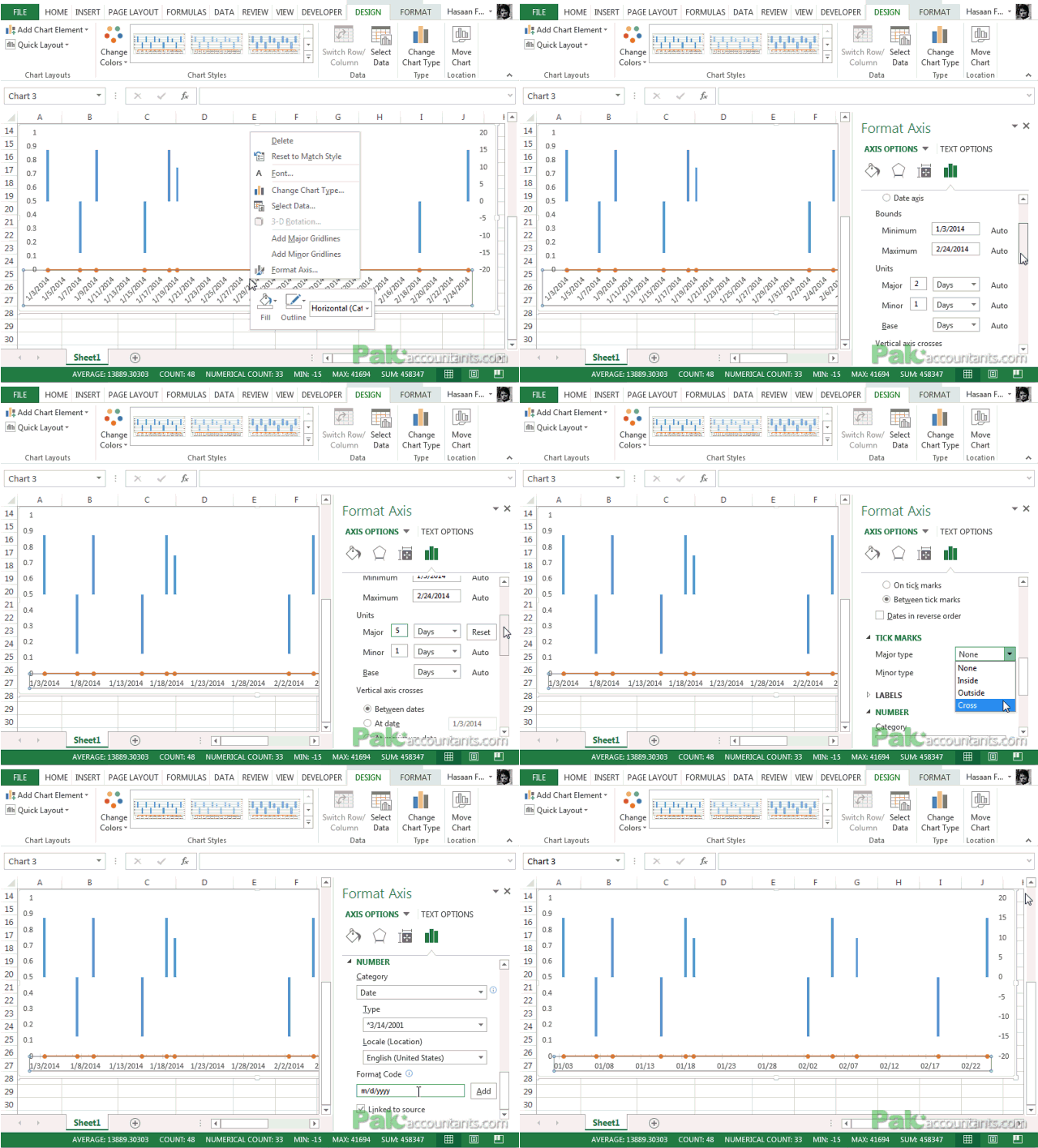
Step 11: Disable y-axis scale on the right and left side of the chart by left clicking on the scale and hitting delete key. You can also do so by going to format options and disabling primary vertical and secondary vertical from axis options drop down. You will get the chart something like this:

Step 12: Select D position series from the drop down in the current selection group and for Line options select no line. This will take out the line and will leave the chart only with markers.
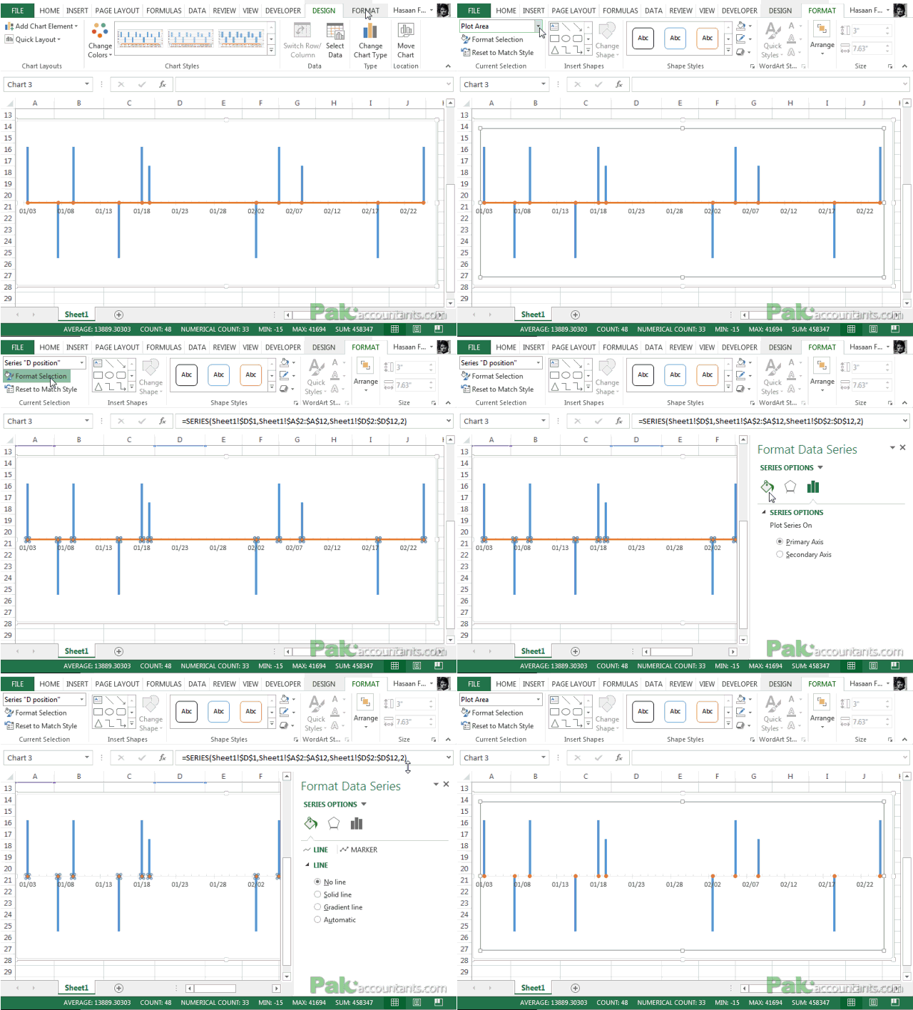
Project timeline chart is complete and if you are happy with you can stop here. However, it is not exactly the same as we want. Bars are not hairline thin. To get this we have two options:
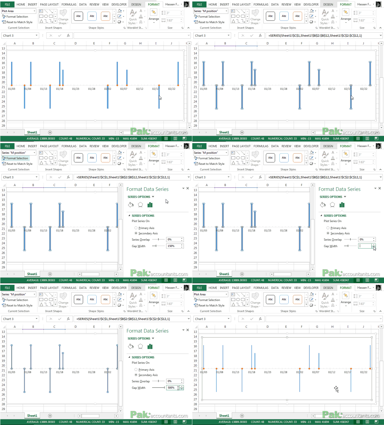
- Increase the gap width of bars to max.
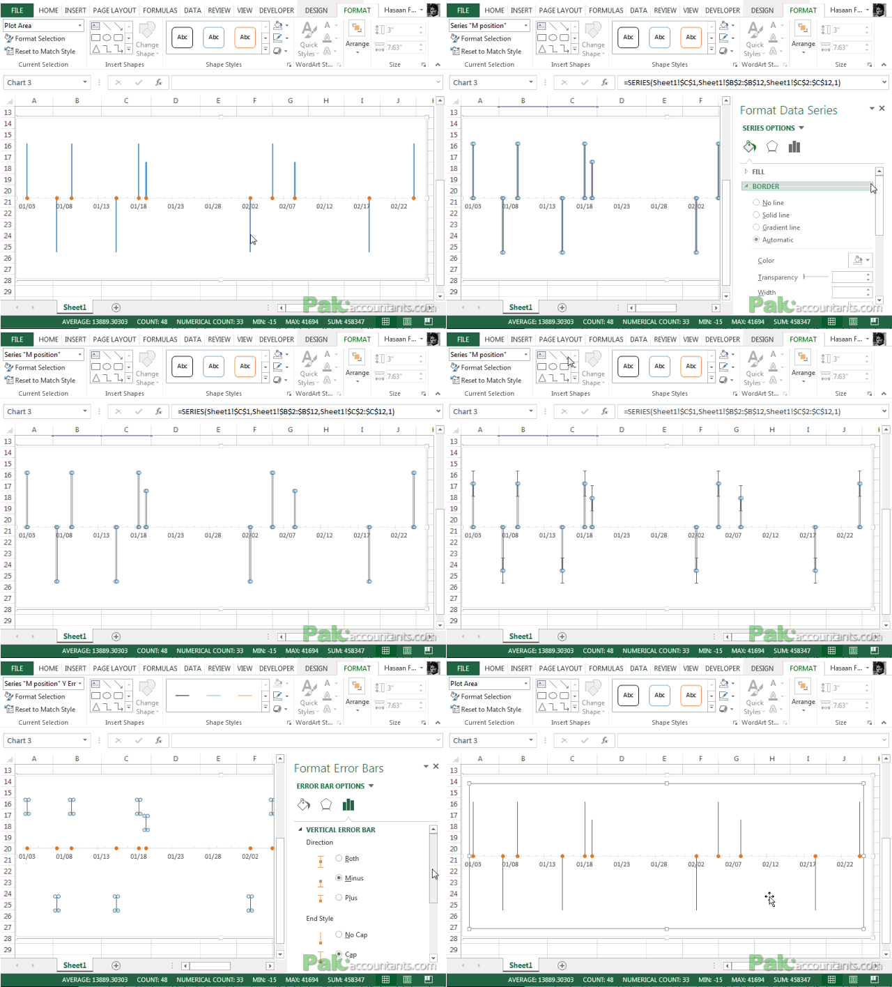
- Use error bars
First option is simple, easy and fast. Whereas for error bars we need to take additional steps. I will explain both. Step 13A will show the first option whereas Step 13B will show the use of error bars. You either have to do 13A or 13B NOT both.
Step 13A: Click on bars and under series option increase the gap width to max i.e. 500%. DONE!
Step 13B: What we need is error bars for M position series. For that first select M position series then click format selection and select no fill. This will hide the bars itself. Then go to Design > Add chart element > Error bars > standard error. This will insert error bars. With error bars selected select minus under direction. Click select percentage under error amount and punch in 100%. DONE!
Step 14: Last touch is about data labels that can help show milestone names. For that have M position selected and go to design tab under chart tools > add chart element drop down > Data labels > Outside end. Click on labels and under label options select category name instead of value. Now you have that beautiful timeline we saw in the beginning.

Download Free Project Timeline in Excel Template
Liked Project Timeline Charts in Excel Tutorial? – Pin it!


Thank you
Thank you!
I don’t appear to be able to get Step 6 to work in my version (Office 365), dispite selecting Series 2, it appear to change both M and D to line graphs.
Nice! Excellent tutorial. Thank you
Very nice tutorial. This is 2019 and of course the screen interfaces are different. Is there an update?
Dear Hassan,
in this example, the dates are not shown exact you mention in the table, i need to show exact date on my problem to show specific change in date.
can you explain me?
Thanks.
Excellent
This is excellent! However, rather than DATES, I need to plot TIME. Is there a way to create this with minutes or hours?
Dear Hasaan,
what a brilliant chart! It’s just excellent for my purpose.
The only problem i encounter is that i’m not able to scale the X-axe (unable to insert minor/major unit etc)
could you help me out?
kind regards,
Robin
Thank you for making this tutorial! It is very helpful.
I am running in to a problem when I sort the parent table. If it is not sorted in chronological order by the date column, the chart is incorrect. What is causing this?
Thank you.
mmm… let me guess… chart will display in the order data is stored. in case of timeline if its not arranged it may cause problems as dates should be in chrono-order. Share the snapshot of a problem if I haven’t understood it correctly. And thanks for visiting!