Variance Analysis in Excel – Making better Budget Vs Actual charts
Either it is about daily life or business, we almost all the time in our minds comparing the actual results with our plans. Though we can talk numbers and percentages but the way charts...
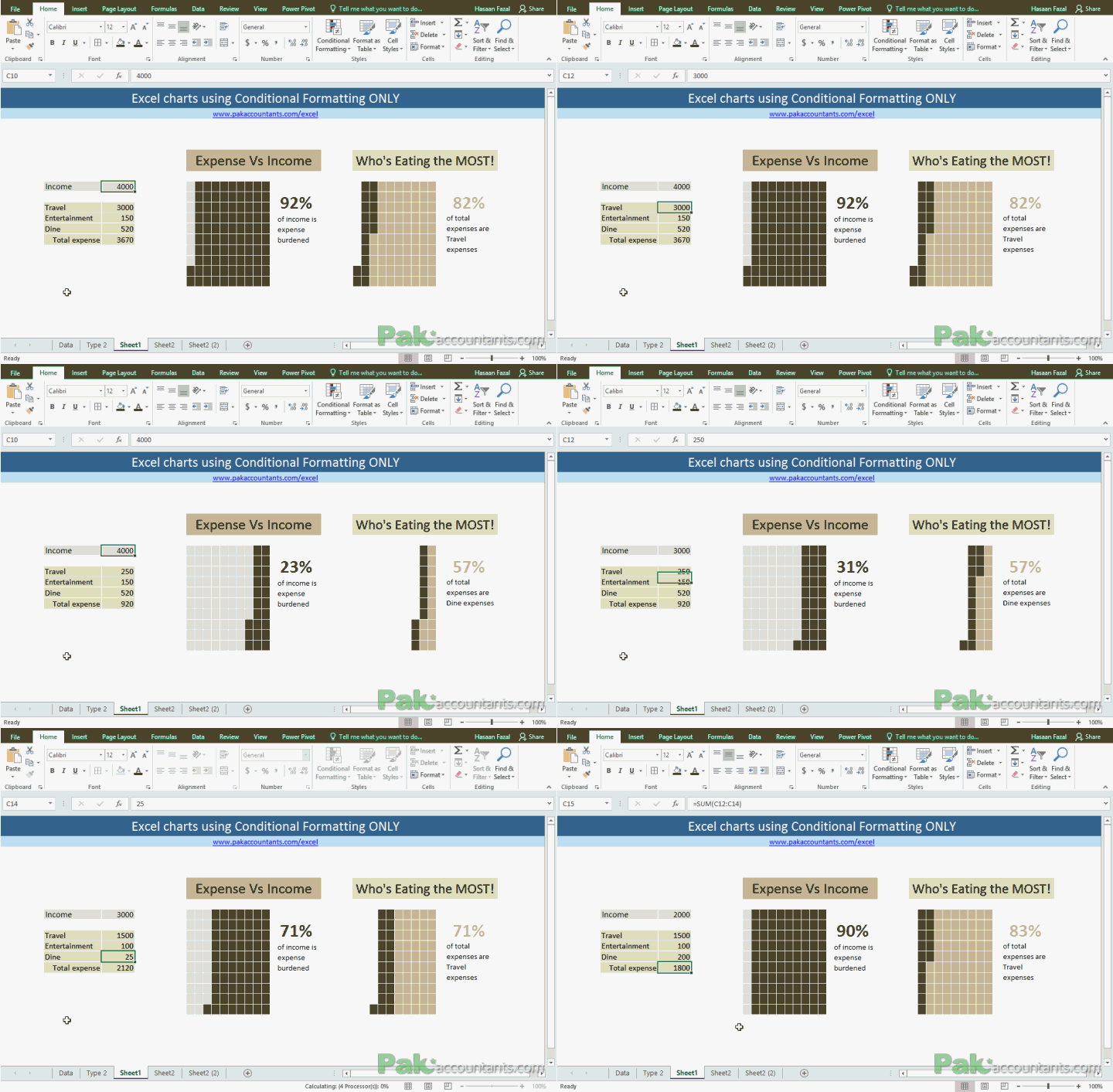
Make Waffle Charts in Excel using Conditional Formatting – How To
To get the inspiration for better charts and Excel dashboards one must be observant of such pieces of information that are often found in newspapers and the internet. For that matter, Pinterest and The...
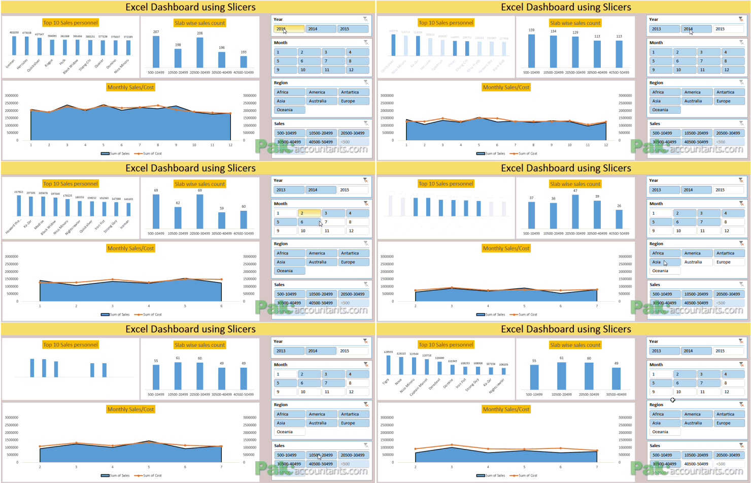
Making Sales Dashboard using Excel Slicers – How To
So many reasons why not to hate Excel dashboards. They are beautiful, they are dynamic, they make everything super easy to understand. And not to mention it one cool way to grab attention at...
Custom Data Labels with Colors and Symbols in Excel Charts – [How To]
Is it possible to have colored data labels like red for negatives and blue or green for positive values inside excel chart? This question was asked by some when I posted Variance Analysis in Excel – Making better...
Creating and Working with Dynamic Charts in Excel
Title should be "making charts dance to your command in Excel" but lets keep it technical :)
OK let me be very quick at it as I learnt about this almost by chance. I used...
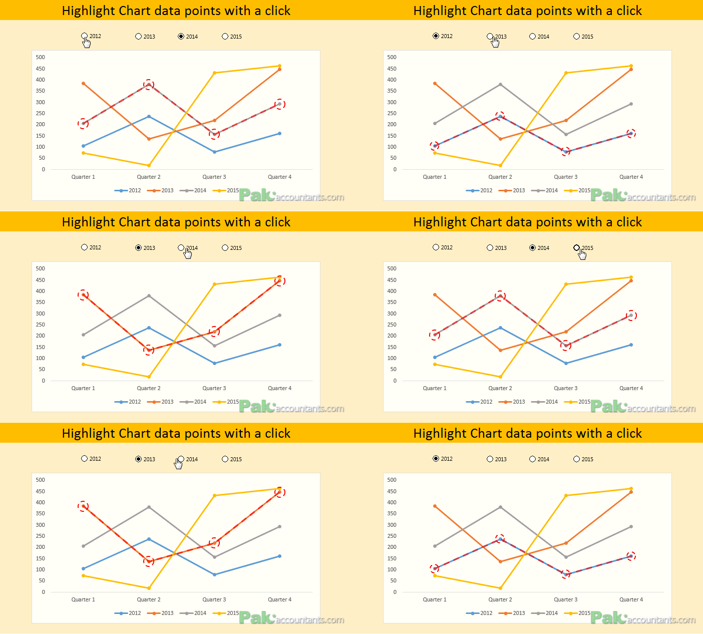
Conditionally Format Chart’s Background in Excel – How To
Excel charting is in the air for last few weeks and we are learning some really cool tricks on making charts better looking and also fulfilling the purpose. Today we will learn how to...
Making BCG Matrix in Excel – How To
BCG matrix is a strategic decision making technique that helps in resource allocation among different cost centers or cost objects by categorizing or ranking them based on their ability to generate cash inflows against...


![Custom Data Labels with Colors and Symbols in Excel Charts – [How To]](https://pakaccountants.com/wp-content/uploads/2014/09/data-label-chart-1.gif)

