Enable or Disable Excel Data Labels at the click of a button – How...
Data labels in Excel charts can help users to get the information right at that spot without referring to any other source of information. In some situations however, same data labels can get in...
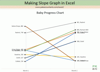
Making a Slope Chart or Bump Chart in Excel – How To
Excel has many different styles of charts and graphs inbuilt and one can make them with a single click. A great convenience to have. But for charts and graphs convenience is required, merited and...
Making BCG Matrix in Excel – How To
BCG matrix is a strategic decision making technique that helps in resource allocation among different cost centers or cost objects by categorizing or ranking them based on their ability to generate cash inflows against...
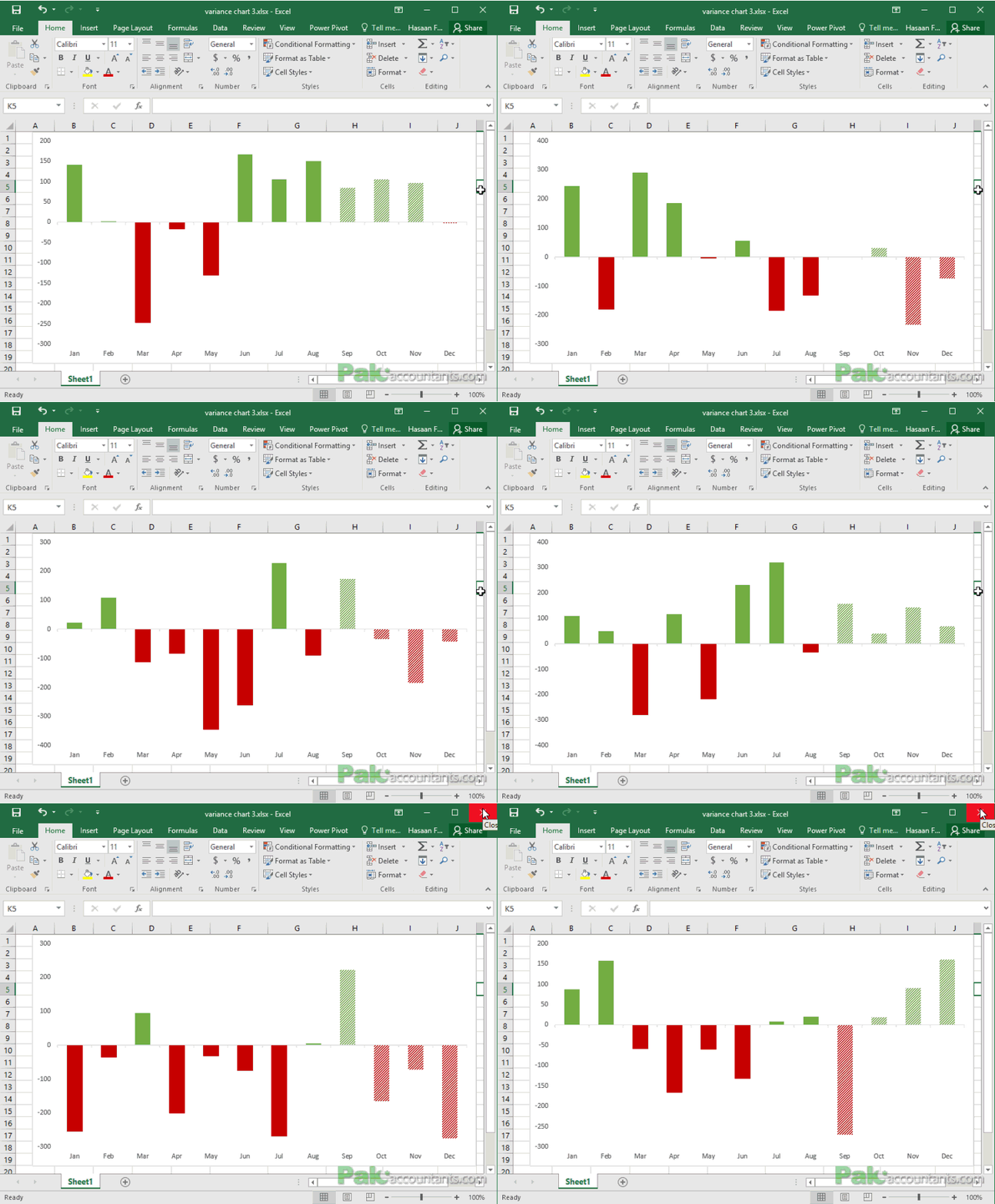
10+ ways to make Excel Variance Reports and Charts – How To
Whether it is daily life thing or any day at work, we are always comparing to see whats good and what is not so good. This differential analysis has a much popular name as variance...
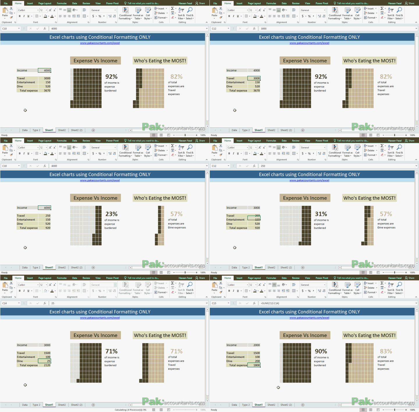
Make Waffle Charts in Excel using Conditional Formatting – How To
To get the inspiration for better charts and Excel dashboards one must be observant of such pieces of information that are often found in newspapers and the internet. For that matter, Pinterest and The...
Moving X-axis labels at the bottom of the chart below negative values in Excel
By default if you insert a bar chart or line chart, the x-axis labels are stuck at 0 position of the axis. This usual behaviour gets in the way especially if you have negative values...
Create Waterfall Charts in Excel – Visualize Income Statements!
A waterfall chart in Excel is a great way to visualize running totals making it super easy to understand how addition and subtraction of values affected starting value and how we reached the final...
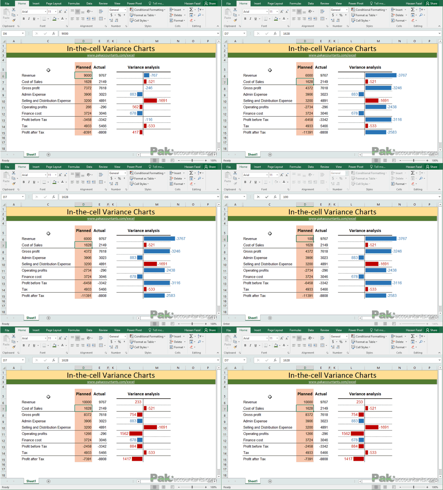
Budget vs Actual Variance Reports with “In the Cell Charts” in Excel
In life we all want to be in control. And usually we measure or judge whether things under control by comparing whats happening with what should be happening. In other words, we tend compare the actual events/results with...
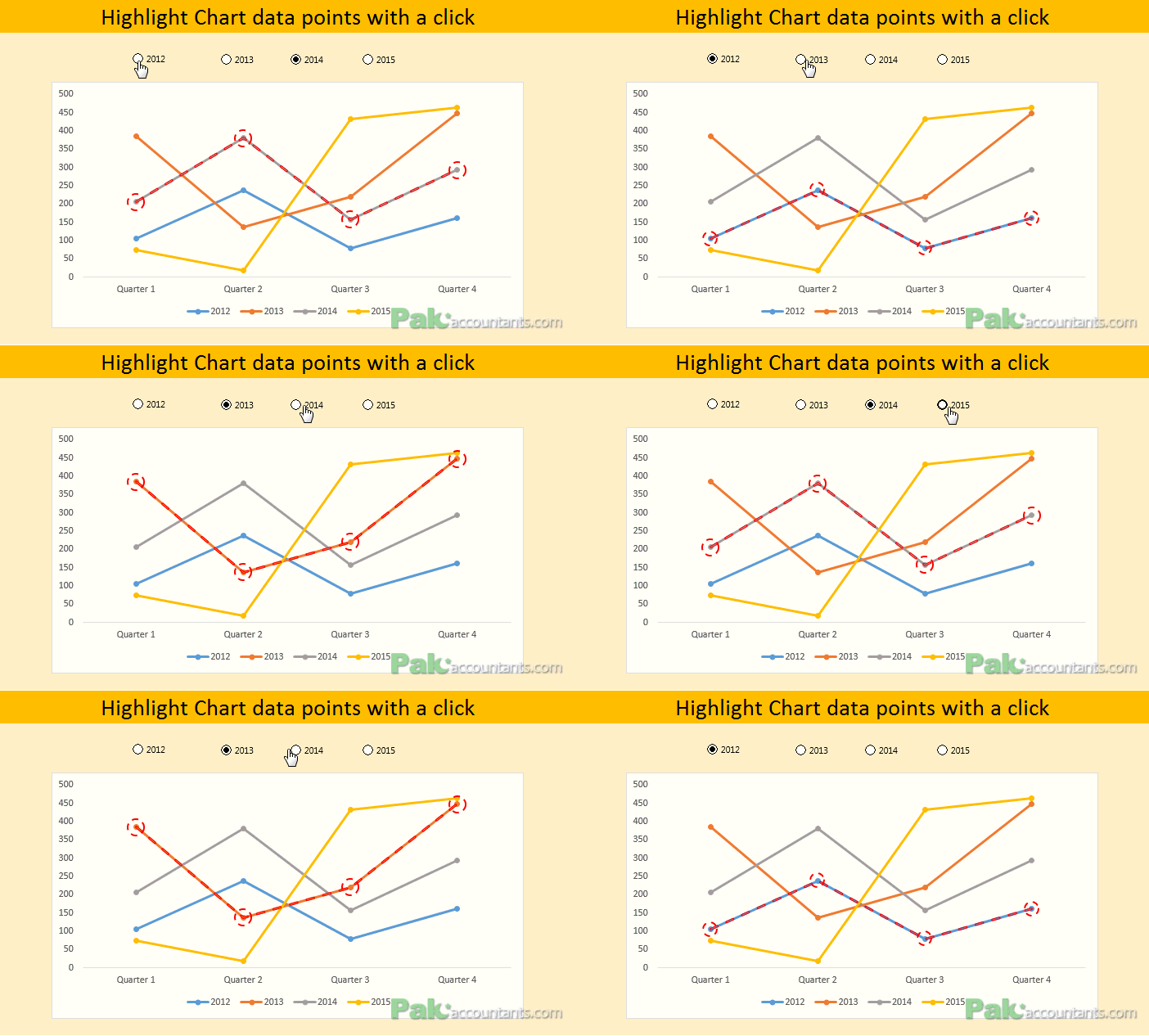
Dynamically Highlight data points in Excel charts using Form Controls
Charts and graphs and other visual means make information easier to understand and analyze. Excel gives plenty of options in this department as different types of graphs are possible.
But in some cases wrong chart types in...
How to show data of hidden rows/columns in Excel Charts
By default if you hide a certain row or column of a data on which a chart is based, Excel will automatically hide that data too. I must confess that I was quite annoyed...


