In Part 1 of this little jump start series on Pivot Tables for Absolute Beginners I explained what excel pivot tables are the science behind their working through example and explained how pivot table let you analyze and make great reports by presenting them in meaningful way.
Following slides will help you understand the basics behind the pivot table and how a tabular data is converted in meaningful reports.
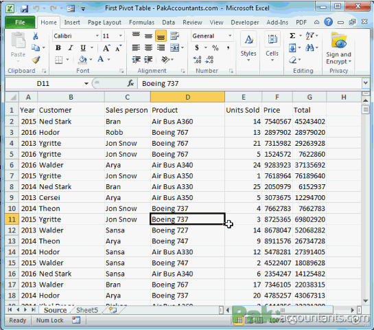
Prepping your data – Very Important!
OK! If you are already taken up by the hype that Excel pivot tables is to do something impossible out of nothing then let me drag you back on human earth. Although almost all the data prepared in Excel can be used in pivot tables but following key points need attention:
- Data must be in a shape that Excel can handle i.e. it must be put in order in cells, rows and columns.
- Data can be a mix of numbers and text but majority of the data is about numbers.
- Rows and categories are usually used to categorize further information inside a data set. For example sales data of year 2012 will have regions, customers, sales person, products, amounts sold, totals etc. Each of these is part of whole data and are usually put in columns i.e. customers will go in one column, sales person go in another. These information subsets must not be mingled as it will not only ruin the data but also the end result will be pointless. As the saying goes, garbage in garbage out. So you might have to work a little before you start the engines.
- The best practice is that data is kept in columnar form i.e. categories must run down the column and not across the column.
- Each column must have headings as the same will be used in pivot tables to generate reports. If you do not have appropriate column headings you will have hard time understanding the report as well in the end.
- Each column name has to be unique, purposeful and clearly describing the data it holds.
Going Bare-bone or T-Bone
Once you have data optimized for pivot table, you have the option either inject it straight or first convert the data range into tables and then use the tables to prepare pivot tables.
Personally I prefer converting a data range first into table and then make a pivot table from it. There are several reasons why I love to setup tables first but one very technical one is that it makes pivot tables dynamic. I will not be including the details how. But if you are interested in Excel tables then following links will help you:
Step-by-Step – Getting there
I will explain both ways to approach pivot tables i.e. straight method or table method. You can choose which approach you like. I recommend you learn both of them.
Step 2: Go to Insert tab > Tables group > Click Pivot Table button.
Step 3: A dialogue box will appear. In data range field the address of data selected is already captured by Excel. You have the option to make pivot table in a new worksheet or existing worksheet. Keep the new worksheet selected. Click OK.
What happens once you click OK is discussed later in this article after approach 2 is discussed

Step 2: Excel will automatically select the whole data range and a new dialogue box appears. Make sure “My data has headers” is selected and click OK.
Now you have the Excel tables. To make pivot table out of it read on.
Step 3: Having an active cell within table, click the contextual “Design” tab (which is under the name Table Tools). This tab is called contextual tab because it is active and visible only if you have active cell within table and it will disappear if you click anywhere outside the table.
Step 4: Once inside contextual tab, go to Tools group and click Summarize with pivot table button.
Step 5: A dialogue box will appear containing the name of table. Make sure new worksheet is selected and click OK.
So in above two approaches we stopped just before we press OK button so lets move forward now and see what happens when you press OK button
Step by Step – Making your first ever pivot table report
Once you are through all the steps using any of the two approaches discussed above, excel will do the excellence and insert a new worksheet and a very strange looking task pane on the right of new worksheet will appear. It is divided into two sections. List and boxes. List is actually the columns and the data inside them whereas boxes represent the arrangement options.

Following steps help you understand what they really are and how to proceed further to get our first pivot report.
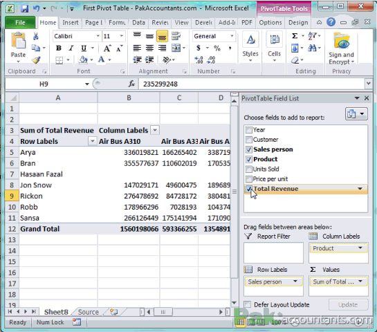
Step 1: Move cursor above Total Revenue label in the task pane, press left mouse button and hold (don’t let go, keep pressing and drag it down to reach Values box and let go the left mouse button. You will have the total field resting inside the fourth quadrant and in the list, totals field will get checked (ticked) automatically.
Step 2: Do the same with Products and Sales Person fields as well. Drag the products field in column labels box and sales person in row labels box.
Once you are done click anywhere inside worksheet and task pane will collapse automatically giving you full view of your pivot table. Scroll to the right to see the results.
Following animation explain these two steps:

Congratulations! You have made your very first pivot report or pivot table. But what is it telling? In present condition it is telling:
- how much revenue each sales person has generated against each product where sales persons are listed in a column and products are listed in a row.

- Conversely it is also telling how much revenue is generated by each sales person for each product.

- How much revenue is generated by each product. See the bottom row of grand total colored blue.
- How much revenue each sales person has generated. Scroll the worksheet right to see the last grand total column.


Modifying your first Pivot report – Milling more magnificence
Once you get your first report done you are all free to play around and adds field in different boxes to see their effect and how report changes its shape instantly to give you another perspective of affairs. Following modifications will help you get a new type of information from the same data set by merely moving few things here and there. Remember I said about match stick game in episode 1? Exactly! 🙂
Pivot Table / Pivot Report – Examples
Following examples of modifications in pivot table help you understand how pivot reports are generated by moving fields from one block to another.
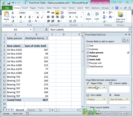
How many units of each product are sold?
Remove all the fields from the boxes if there are any then drag:
- Units sold field to values box
- Products field to row label box
How many units of each product sold by particular sales person(s)?
If you want to know the units of each product sold by particular employee then move Sales person field in Report Filter box.
A new field just above the pivot report will be available. Click drop down and select the employee for which you want to know. If you want to know the results of multiple sales persons then check the option select multiple items and click OK.

Grouping/Showing products sold with number of units by each sales person
Just move the sales person field from report filter by box to row label box. DONE! 🙂
To achieve even better presentation will be to to move sales person field in column label box. This will give you the products going down the column and sales person going right along the row. Bravo!

Reporting units sold and revenue generated by each product/sales person
In row label box have:
- Products or sales person
In values box (in the order specified):
- Units sold
- Total Revenue

Reporting units sold and revenue generated by each product against each year
In row label box put:
- Products
In column label box put:
- years
In value box put the following in stated order:
- Units sold
- Total

DIY – Pivot Table Example
Have a look at the following picture of the boxes. Have the items arrange in this manner and then checkout the awesome report you generate containing information regarding how many units are sold, how much revenue generated by each product by each sales person. And the time it took to make = How fast you can move your mouse?
Note: Don’t care about the SUM Values item in the Row Label box under Product, it gets inserted by Excel automatically if it is needed.

Whats Next?
If you are one of them who didn’t understood Part 1 of this series then give it a reading again to understand the Pivot Table mechanism fully so that you can deploy this feature at best
As you have just excelled massively on Excel you are free to play with your report as long as you can and learn how and what kind of reports you can generate and what information they provide. And if you are hungry to learn more about Pivot Tables then visit this page to access all articles, tips and tricks covered so far.
Do you love pivot tables as well? Let the community know what you do with them and if you care sharing some tricks comment box is all yours 😀
I need to do a pivot with chart on increases, no cost, just a chart on the increases per month, I figure there has to be a way to calculate percentage increase from first increase
I need to do a pivot with chart on increases, no cost, just a chart on the increases per month, I figure there has to be a way to calculate percentage increase from first increase
Please I need to cnage my email addres to the below
It was really helpful
very well explained really good for beginners
Its good for learning
Really Helpful.
Can I obtain help on function “Subtotal” as well?
Thanks
Regards