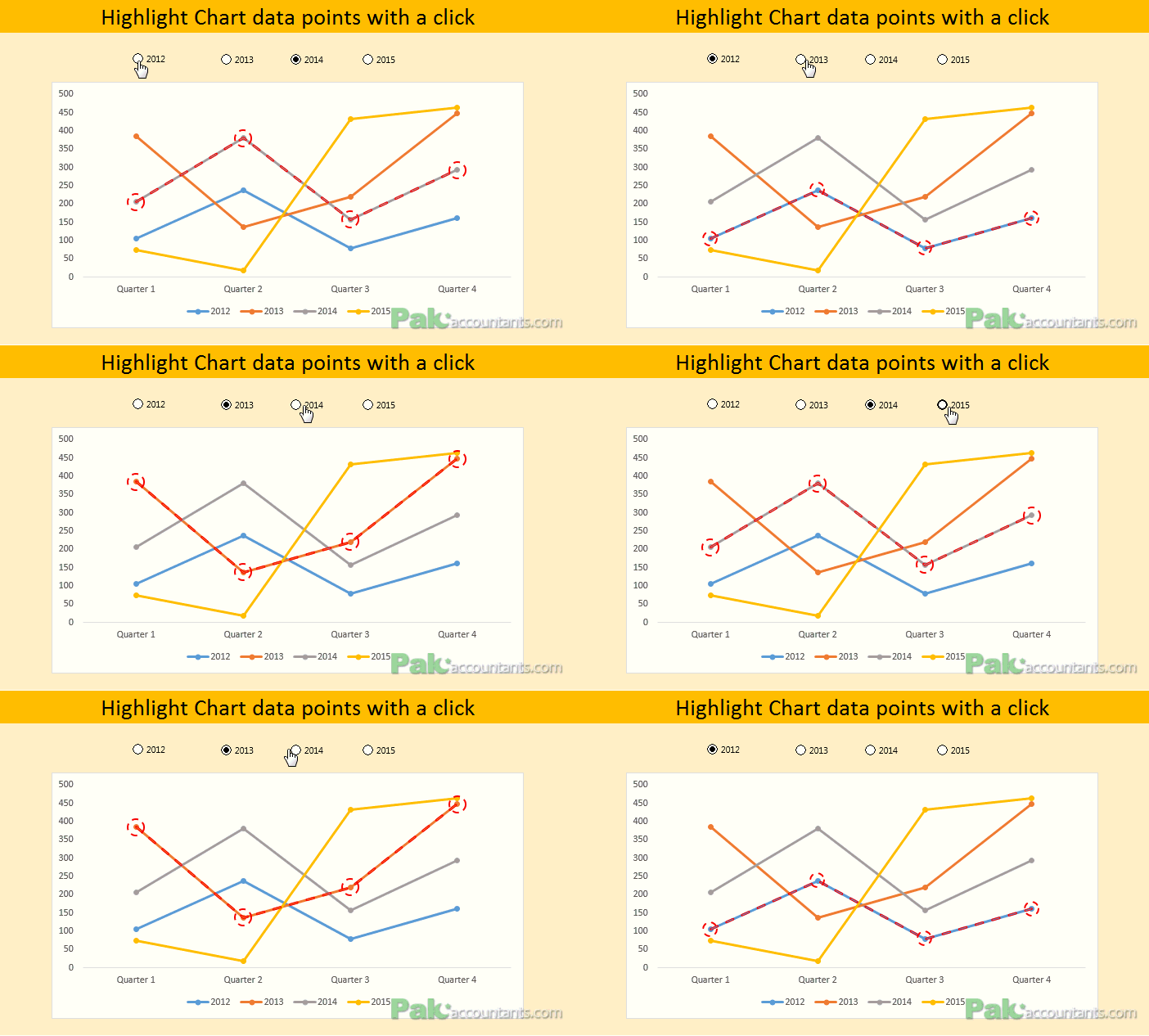
How to show data of hidden rows/columns in Excel Charts
By default if you hide a certain row or column of a data on which a chart is based, Excel will automatically hide that data too. I must confess that I was quite annoyed...
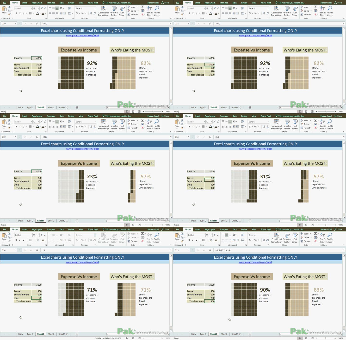
Make Waffle Charts in Excel using Conditional Formatting – How To
To get the inspiration for better charts and Excel dashboards one must be observant of such pieces of information that are often found in newspapers and the internet. For that matter, Pinterest and The...
Excel chart of Top / Bottom “N” values using RANK() function and Form controls
Ever fancied that you have large set of data and from it you can have a chart of top or bottom N values and better yet you have the ability to switch between chart...
Create Waterfall Charts in Excel – Visualize Income Statements!
A waterfall chart in Excel is a great way to visualize running totals making it super easy to understand how addition and subtraction of values affected starting value and how we reached the final...
Custom Data Labels with Colors and Symbols in Excel Charts – [How To]
Is it possible to have colored data labels like red for negatives and blue or green for positive values inside excel chart? This question was asked by some when I posted Variance Analysis in Excel – Making better...
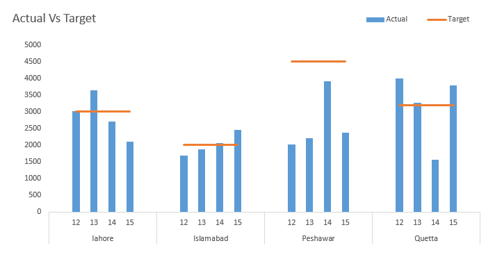
Excel Actual Vs Target – Multi type charts with Subcategory axis and Broken line...
Last time when we learnt about multi-category axis we saw how meaningful chart can become. But today we are going to add in more flavours and ingredients to it and by the end of this...
10+ ways to make Excel Variance Reports and Charts – How To
Whether it is daily life thing or any day at work, we are always comparing to see whats good and what is not so good. This differential analysis has a much popular name as variance...
Create Simple Dial Charts in Excel – How To
Charting or graphing is one of the biggest punch Excel has. Visual presentation of data greatly improves user's ability to comprehend the information and significantly cuts down the time to take decisions. That is...
Creating Excel charts with Subcategory axis – [Quick Tip]
This is definitely a neat trick. Usually we have single X-axis chart element. But you can have multi-category axis to show the information in a much more arranged manner. Following is what we are after....
Making Horizontal Dot Plot or Dumbbell Charts in Excel – How To
Dumbbell charts also called connected dot plot or DNA chart or lollipop charts are not available as builtin charts in Excel by default. But they prove awesome visual aid in certain situations. A great...

![Excel Chart with highest value in different colour – Multi Color Bar Charts [How To]](https://pakaccountants.com/wp-content/uploads/2013/05/excel-tips-and-tricks.png)


![Custom Data Labels with Colors and Symbols in Excel Charts – [How To]](https://pakaccountants.com/wp-content/uploads/2014/09/data-label-chart-1.gif)


