Excel Variance Charts: Making Awesome Actual vs Target Or Budget Graphs – How To
In this tutorial we are learning how to make an awesome variance chart in Excel that clearly plots actual and target (budgeted) figures using bars and variances (favourable and unfavourable) with arrows so beautifully that...
Creating and Working with Dynamic Charts in Excel
Title should be "making charts dance to your command in Excel" but lets keep it technical :)
OK let me be very quick at it as I learnt about this almost by chance. I used...
Conditionally Format Chart’s Background in Excel – How To
Excel charting is in the air for last few weeks and we are learning some really cool tricks on making charts better looking and also fulfilling the purpose. Today we will learn how to...
Conditional Charts in Excel – Workaround + How To
Last time we learnt how to make simple dial charts. There is so much to be discussed as basics to Excel charting but without little fun and doing out of ordinary is what everyone...
Create Excel Charts with Bands or Threshold in the background – [How To]
Just the other day I was teaching my ACCA F5 students about variance analysis and there we learnt that not every variance needs to be investigated and only those should be probed that breach...
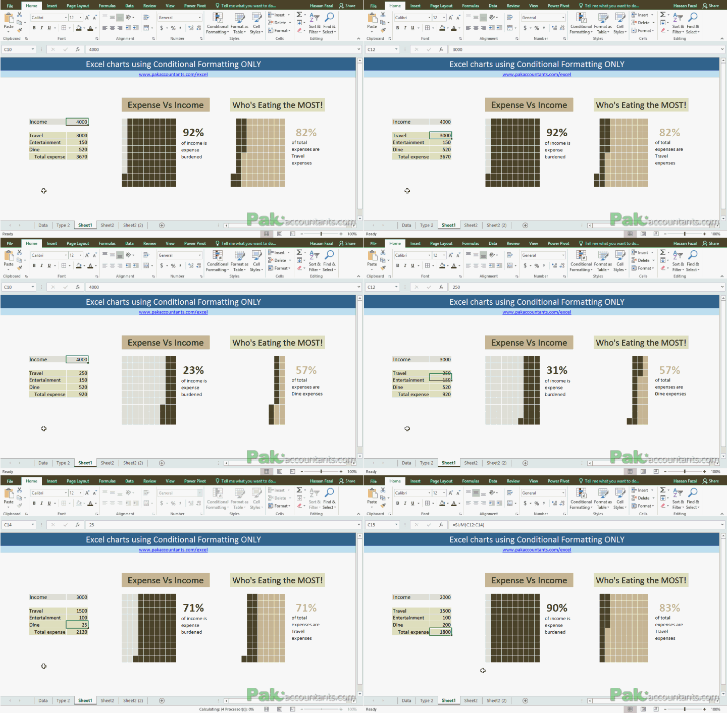
Make Waffle Charts in Excel using Conditional Formatting – How To
To get the inspiration for better charts and Excel dashboards one must be observant of such pieces of information that are often found in newspapers and the internet. For that matter, Pinterest and The...
Creating Scrollable Charts in Excel [How To]
Last time we discussed on how to have a subset of data within worksheet that scrolls independently and I called it scrollable data ranges. It was fun as we involved one of the Excel...
Making Interactive Charts in Excel [How To]
Graphs and charts are amazing tools to understand the information in the blink of an eye. It not only saves you from reading at all levels. That is why charts and Excel is one...
Create Waterfall Charts in Excel – Visualize Income Statements!
A waterfall chart in Excel is a great way to visualize running totals making it super easy to understand how addition and subtraction of values affected starting value and how we reached the final...
How to show data of hidden rows/columns in Excel Charts
By default if you hide a certain row or column of a data on which a chart is based, Excel will automatically hide that data too. I must confess that I was quite annoyed...


