BCG matrix is a strategic decision making technique that helps in resource allocation among different cost centers or cost objects by categorizing or ranking them based on their ability to generate cash inflows against cash consumption or cash outflows.
BCG matrix helps putting products in four different quadrants of graph based on their relative market share and market growth. Such presentation help take prioritizing and deciding what product to be given how much attention and resources.
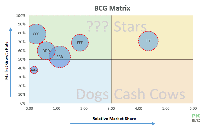
Here is the BCG matrix built right in Excel:
Its really easy to make. All you need is an appropriate data and the way to plot the bubble chart with few tweaks if needed. Following are step-by-step to get the chart with all the needed bits and rest is simple formatting:
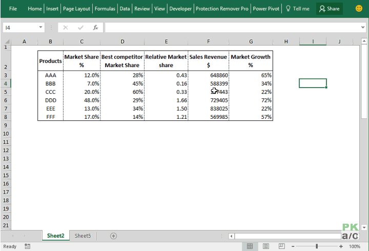
Step 1: For BCG matrix the data is quite straight forward. Following is the data I used:

All the numbers are given except the relative market share which is calculated by taking the ration of Market share % with best competitor market share.
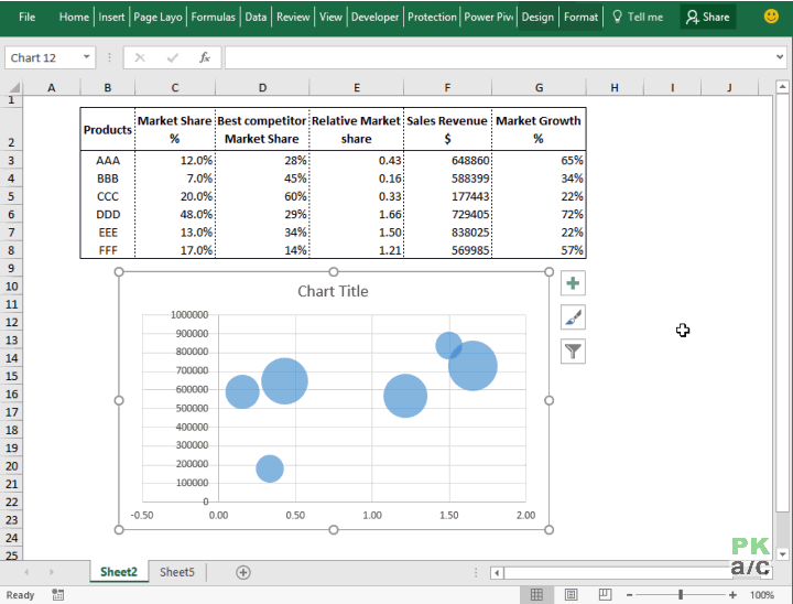
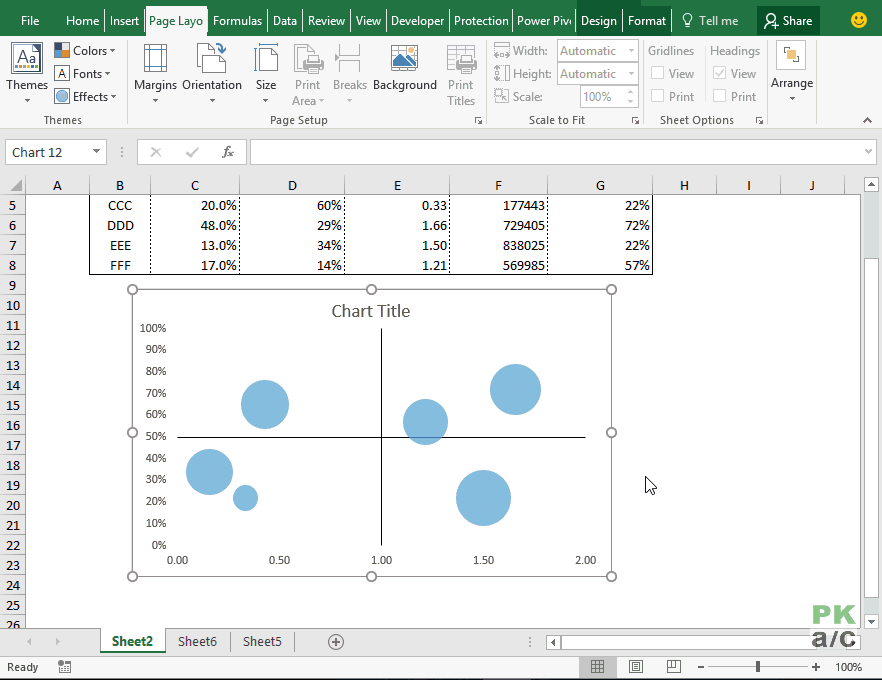
Step 2: Once we have the data, simply select ONLY the figures of the last three columns i.e. relative market share, sales revenue and Market growth %. Go to Insert > charts group > click scatter chart button > click bubble chart. A chart will be inserted that is probably not what we require.
Step 3: In my case as chart isn’t plotted against with the right variables on y axis, so it will require an adjustment. Its easy to do. Simply click on any bubble to select the series and shuffle the quadrants of revenue and Market growth with each other. This will fix the chart.
Now that we have our chart ready, we need to make cosmetic changes to it like moving both axis in the middle to make four quadrants and give it a nice background to make things easy to understand.
Step 4: Right click on x-axis > click format axis. Change the minimum bound to 0 under axis options.
“Under vertical axis crosses” select axis value and mention half of maximum relative market share is in your data or any other suitable figure. As my data is plotted till “2.00” and I have “0.0” as the minimum so half is 1.00.
Click Labels and select low from the list of label position. I also made changes to axis color to make more prominent.
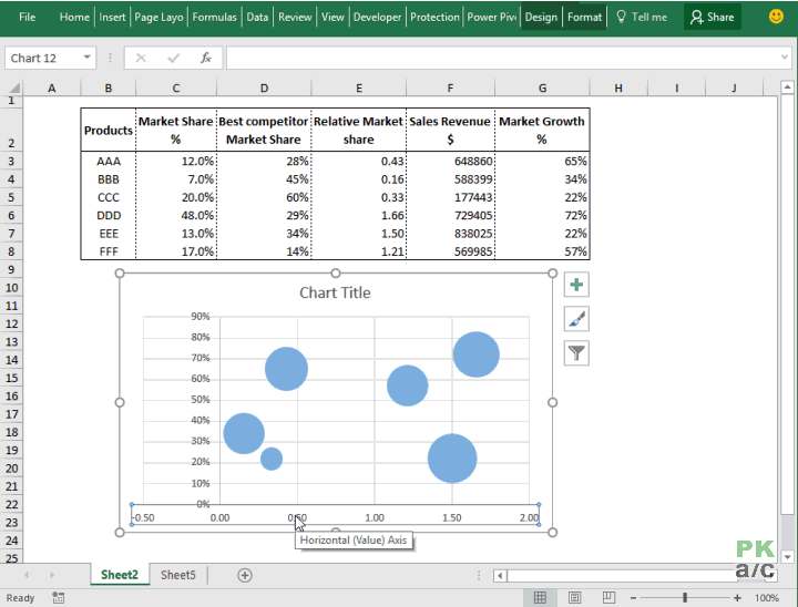
Step 5: Right click on y-axis and click format axis. Set the maximum value to 1.0.
Under “Horizontal axis crosses” select at value and mention 0.5
Click labels and for label position select low.
Again, I change the color of the axis and also made it a little thick to make it prominent.

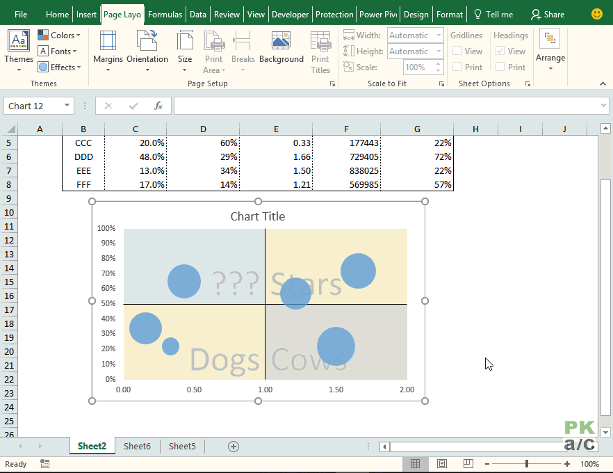
Step 6: For background we need an image divided in four quadrants preferably with different colors. I used Excel to do that for me. And made as following:

Step 7: Now here is the nifty trick. Click “print screen” button on your keyboard and go to MS Paint and have it pasted. Once pasted, select the needed part and click Cut.

Step 8: Once selected and cut, go back to Excel right click inside chart > click format plot area. Under fill select picture or texture fill. Automatically Excel will pull the latest graphics from clipboard.
This is basically it!
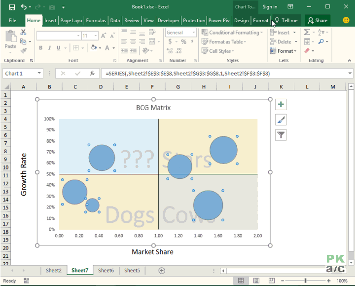
With few more formatting tweaks like changing chart title, your chart is ready. However, I did one additional step so that I can put x-axis and y-axis labels as well. And for that I shifted the graph to another worksheet. Aligned it with cells. Added labels around it and then used camera tool to capture that range and show under the data range.
Once formatted simply select the area and hit Camera button to capture it. And then go to worksheet where you want picture to be pasted and simply left click and Excel will put it there. You can change the dimension of picture just like normal one but to keep the aspect ratio intact I held SHIFT key on the keyboard and changed its size using only diagonal points.
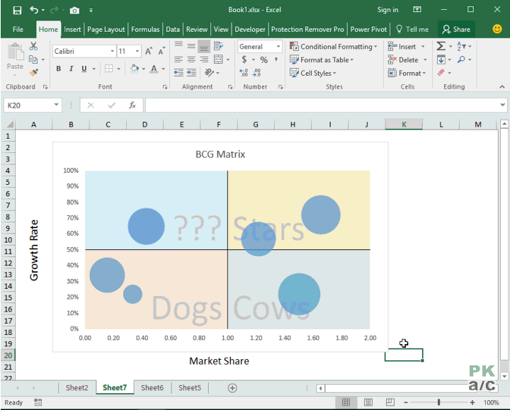
Next I added labels to the products so that one can easily recognize which product is plotted where. To get the names however, there is another trick involved and that is to get the labels from the range of cells.
And here is the final result with added borders around bubbles:
minimum = 0 & Axis Valu= 1.0 (for X) and maximum= 1.0 & Axis Valu=0.5 (for Y) What are these numbers based on and how can you find them from the data table? Is it constant for each table or does it change for different data tables?
Great Work
Check product EEE
Relative Share = ????
This is awesome thank you!!
That was really great. Thank you
Just what I was looking for. I have been trying to explain BCG matrix to my co-worker for almost a month now. I hope this will be more convincing.